To make a new entrant stand out in Adelaide’s highly competitive pizza scene, some serious graphic design is required.
Designing Etica: Pizza al Taglio
When Federico and Mel Pisanelli opened their first venture – the much-loved Etica, which sells Napoli-style pizza – they did pretty much everything themselves, from the design to some of the building works.
But for second restaurant Etica: Pizza al Taglio, the couple didn’t just introduce a different style of pizza from Rome, they also brought on board more collaborators – including graphic designer Carlo Jensen of Peculiar Familia.


Known for his extensive work in hospitality ventures – including Pink Moon Saloon, Gondola Gondola, and BRKLYN – Carlo often collaborates closely with architects on his projects.
For Pizza al Taglio though, Federico and Mel were looking for something different.
The couple were working closely with Oxigen‘s James Hayter on the architecture of the restaurant, which incorporates the now much-discussed hanging cow, included to make diners more informed about the methods via which their food arrives on their plate. But they wanted Carlo to push his design for things like the menu, pizza boxes, and some interior dressing in a different direction.
“It’s an interesting one because normally I work quite closely with the architect and try to make everything have the same visual language,” says Carlo.
“This was kind of the opposite of that – the architect had a very specific vision, but then Fed and Mel had their own specific vision as well, and they kind of wanted heaps of contrast to come from the branding.”
So while Pizza al Tagio’s Oxigen-designed interior features a lot of glass, natural materials, and a darker, mature colour palette, as well as an entirely locally-sourced fit-out, Carlo was encouraged to create an identity almost entirely independently.
So – he turned to the streets of Italy.
“Italian shop front and street signage is amazing,” he says. “There is so much cool typography, ranging from like really whacky naïve stuff, through to almost Fascist typefaces from the war era, through to weirdo modernist stuff – there’s just some whacky fonts they use over there and it’s great.
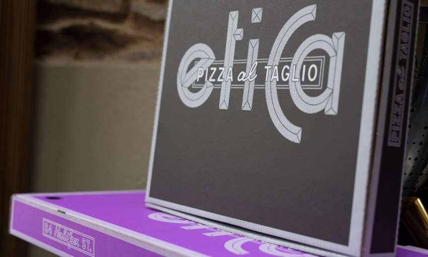
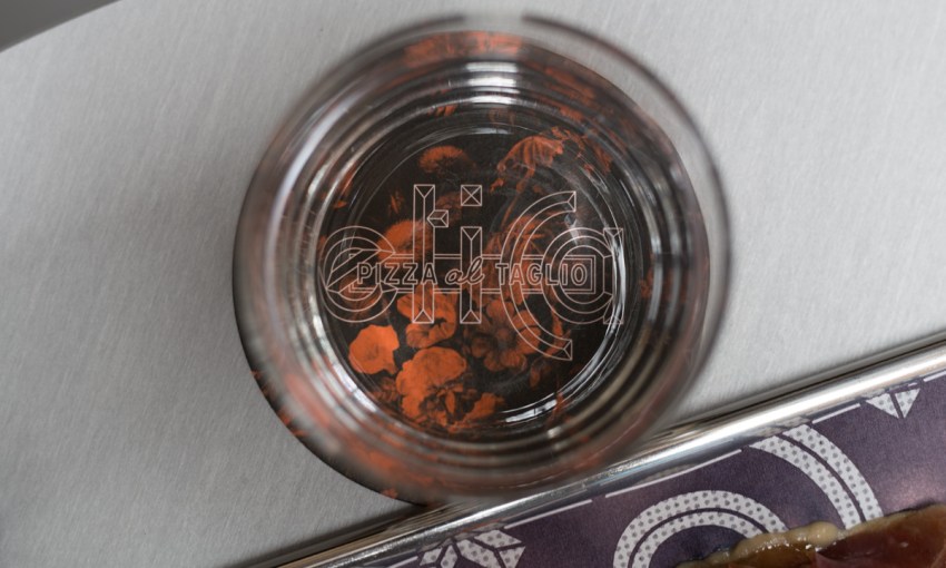
“The logo was based on an existing sign from the ‘40s or something – it wasn’t like a full alphabet that I found, there was only a few letters and then I had to basically make up the other characters.”
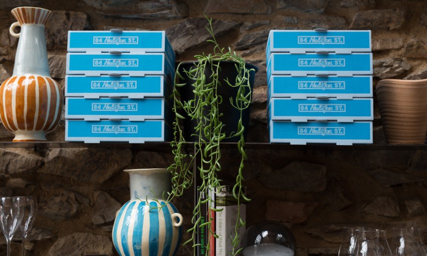
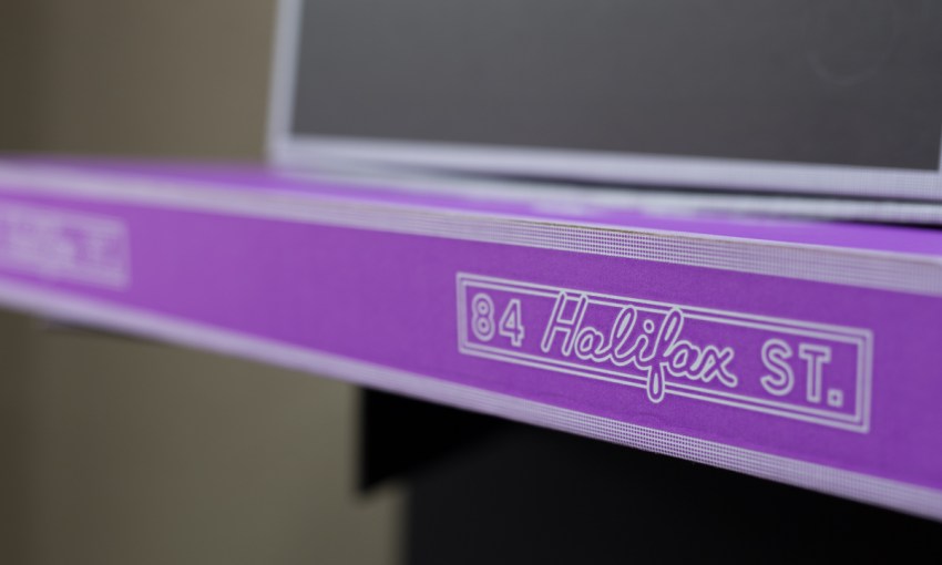
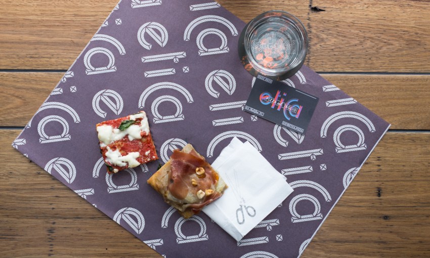
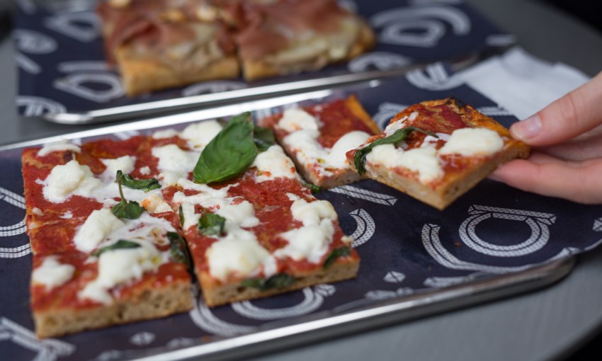
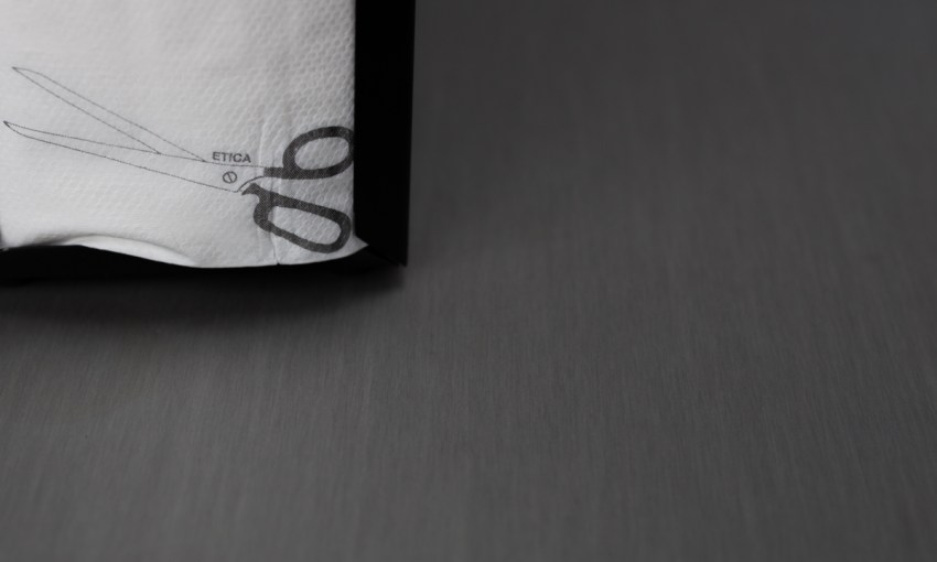
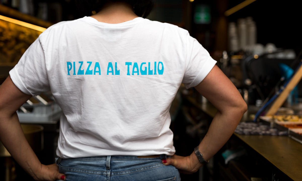
The logo appears on coffee cups, business cards, and on the brightly coloured pizza takeaway boxes that pop out from the restaurant’s interior.
The contents of those books also had an influence on a big neon installation that Carlo designed to adorn one of the restaurant’s walls.
“That neon was sort of a collaborative effort between me and the client,” says Carlo.
“I said, ‘some sort of abstract shaped neon would be pretty cool in that space’, and then they were thinking about making it trace the road from Rome to Naples to signify the journey between the two different restaurants and the two different styles of pizza.
“And at the end there’s the two little wrought iron signs – one says Rome, one says Naples, and they were a bit inspired by some more typography I’d seen in those books.”

While the branding and neon provide contrast, there are some parts of Carlo’s design that do play off and work with the existing context of the restaurant.
“The menu – there was only really one place to do a menu, and it turned out the surface was magnetic, so I think it’s a piece of steel or something that was already there,” says Carlo.
“So I created magnetic letters for the menu – that was a complete custom font that was created and then laser cut out of acrylic and stuck on the magnetic material.”
In its mix of contrast and context, Pizza al Taglio’s design is just right for Mel and Federico’s approach to hospitality – thoughtful, but also a good time.


