

Expressing the many sensations of six months spent cycling along the South Australian coast line - from saddle sores to soaring beauty - seems like an impossible ask from a print publication, but Che Chorley and Voice design may well have done it.
January 15, 2018
Commerce
From pilgrimage to page
- 1
- 2
- 3
- 4
- 5
There will always be a chasm between the imagery that plays in the mind of the storyteller and that which unfolds in the mind of those being told.
But, in communicating the experience of six months spent following SA’s coast from border to border on a bike, photographer Che Chorley wanted to make that gap as small as possible.
Remarks
The Land Sea You Me book is for sale at www.chechorley.com
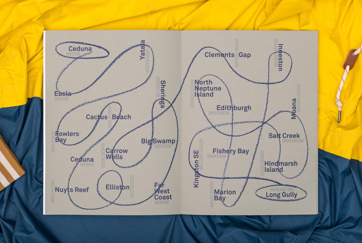
He undertook the journey with the specific purpose of helping South Australia better understand itself.
“I want to see where South Australia is at,” he told CityMag before embarking on the trip.
“I want to learn about the Indigenous history and present of South Australia, I want to add a little bit to the cultural history of our towns and our city and our state.”
But while Che took meticulous notes, created audio recording of everyone he met, and – of course – captured a vast and deep collection of photographs along his often-times harrowing expedition, he needed help working out how to best form these materials into an expression of his own experience.
He had always planned to hold an exhibition of his works, which he did at Chateau Apollo in August. But, he also wanted to create something less ephemeral – a book.
“Originally, I was looking at a traditional coffee table book – hard cover, white, print on demand, knocked up in China at a very low price point,” says Che.
Remarks
The book earned a Pinnacle at the 2017 AGDA Design Awards – the highest possible commendation.
Exposed spine stitching contributes to the book’s tactility
Thankfully, what he’s ended up with is something very different to that.Anthony De Leo of design firm Voice was instrumental in steering Che and his publication down a much more expressive path.
“Our objective was always to produce something quite tactile and raw and unique that aligns with the experience of what he undertook,” says Anthony.
“I don’t claim that we precisely managed to do that to the full extent because he knows what he undertook and I think it’s pretty hard for people to comprehend what he went through. But it has a sense of it.”
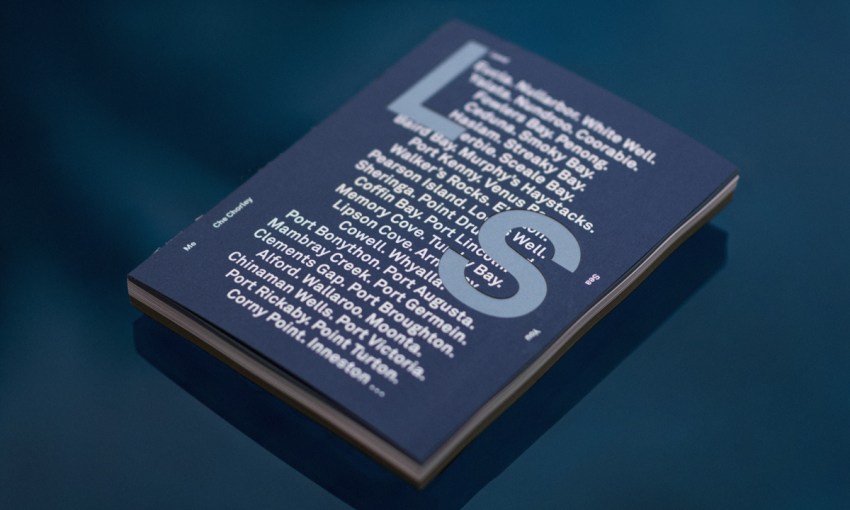
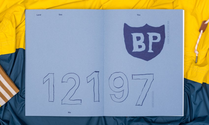
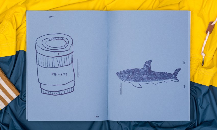
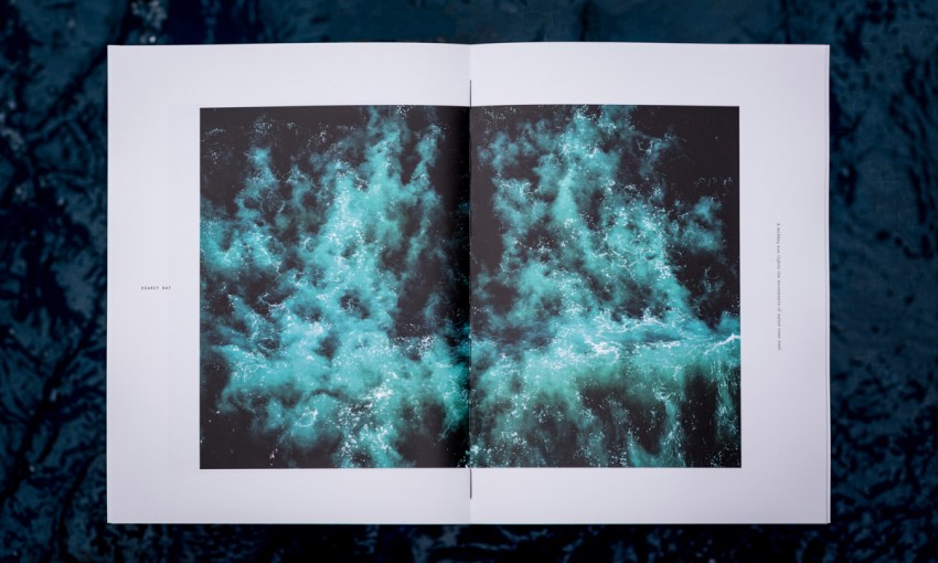
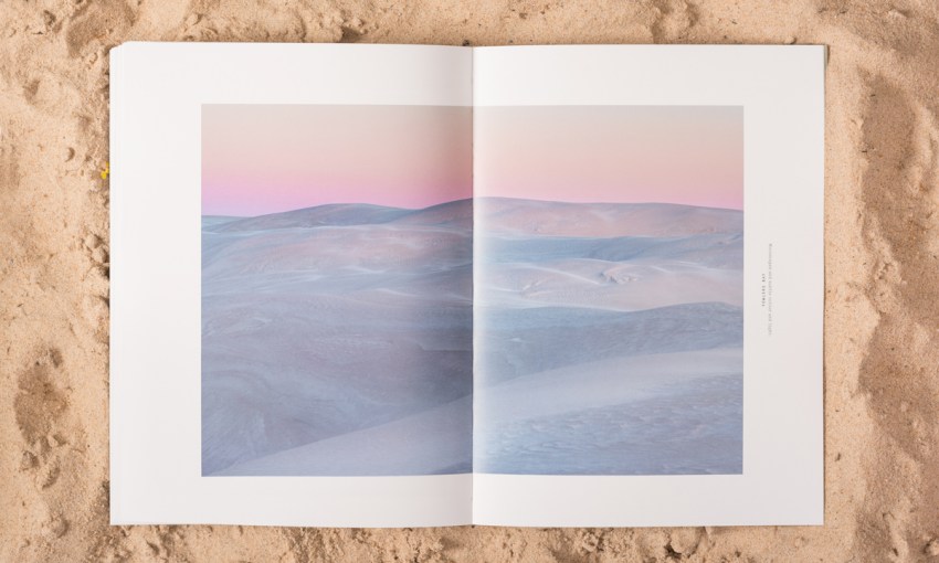
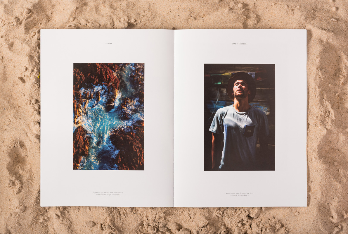
The Land Sea You Me book consists of three major sections – an introduction, a collection of images, and then Che’s writing about the trip.
Choosing to create this structure within the object – which could easily have been tackled more as a traditional book with images interwoven with text – was the first breakthrough in the project.
“I really wanted to leave his imagery alone and just let them be beautiful images and have minimalist intervention with typography,” says Anthony.
“I wanted the images to speak for themselves,” adds Che. “But also once you’ve read through it for them to have a second coming – a new context entirely. To have them intertwined like a traditional publication, I didn’t think that was the right way to do this.”
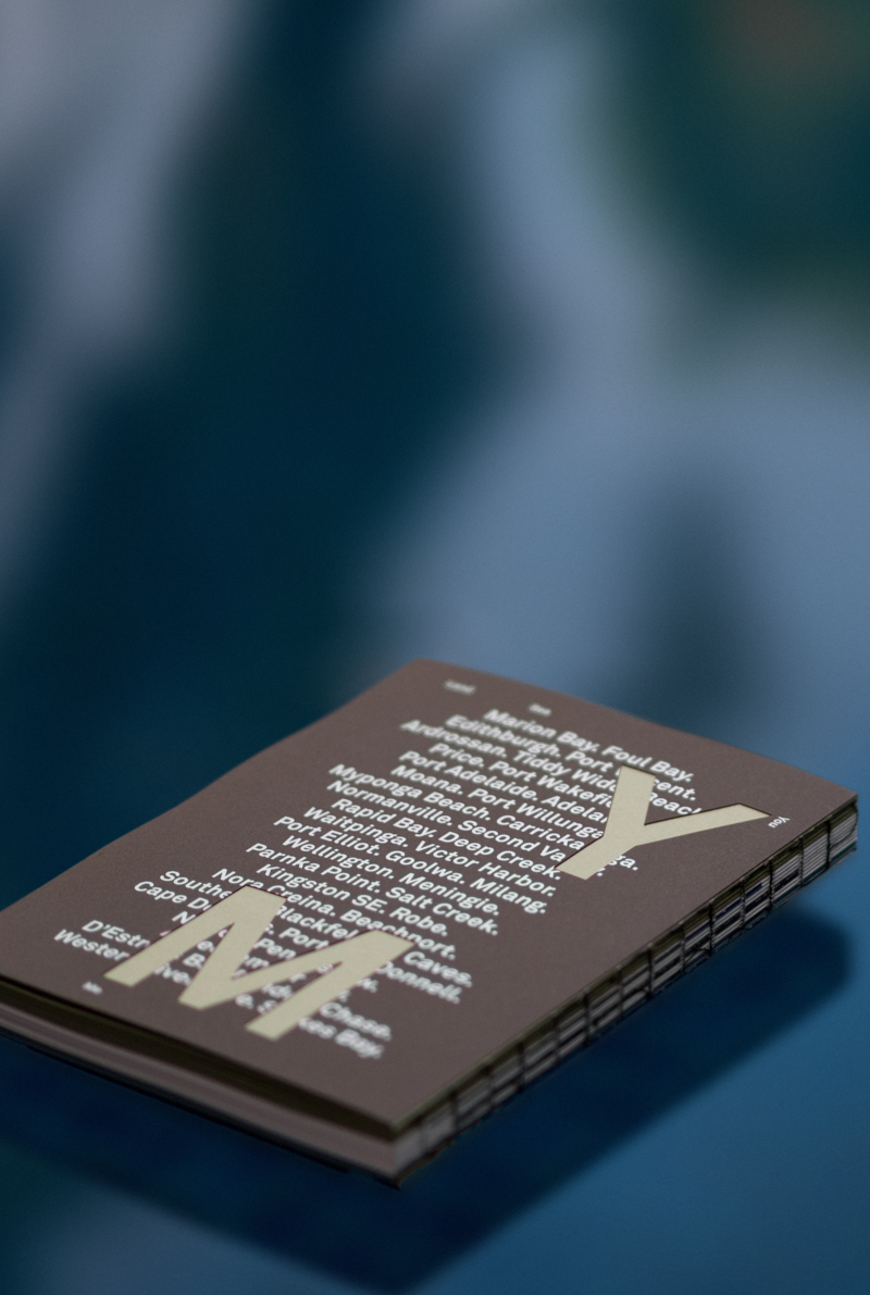
Each section is printed on different paper stock and has its own distinctive aesthetic. Despite that, these three parts still present as elements of a whole – wrapped up in an outer casing that manages to feel both a little raw thanks to exposed spine stitching, but still top quality as a result of foiling and laser cut details.
Achieving this very specific outcome would have been cost prohibitive, but in Che Anthony found a client that was willing to do whatever was necessary – including adhering 400 front and back covers by hand – to achieve the desired effect.
“We had the covers foiled, then Che had to take them away for the weekend and put adhesive on the back of them, and then we had them laser cut, and then Che had to apply them all front and back, so it was a four-part process just for the cover,” says Anthony.
It’s been an exhausting journey, and an exhaustive design process. But flicking through the pages of the book, a sense of what Che experienced – the drifting mist off the sea, the looks from passers-by (some friendly and some less so), the exhaustion, the skull-shifting beauty – does seem to rise from the page.
Share —