

Tyrone Ormsby spent days digging through the dusty archives of the Contemporary Art Centre of South Australia and Australian Experimental Art Foundation in order to filter history into the new brand identity for the city’s forward-facing contemporary arts organisation, ACE.
August 30, 2022
Commerce
Back to the future
- 1
- 2
Tyrone Ormsby describes the days leafing through South Australia’s decades-old arts materials, which were spread across two trestle tables, as generous.
“First, it’s fun because you’re just looking at history, and there’s photos in there of a performance in 1970-whatever,” he says, “and then you’re just going through and discovering things.”
After spotting obviously interesting artefacts, such as pamphlets for (then) up-coming shows and brochures about famous visiting guests, he stumbles onto more subtle nods to yesteryear. These include subconscious design cues – such as colours, fonts and other anachronistic design elements – hinting at what was once considered a prized aesthetic in postcode 5000.
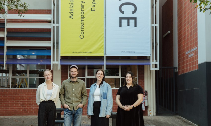
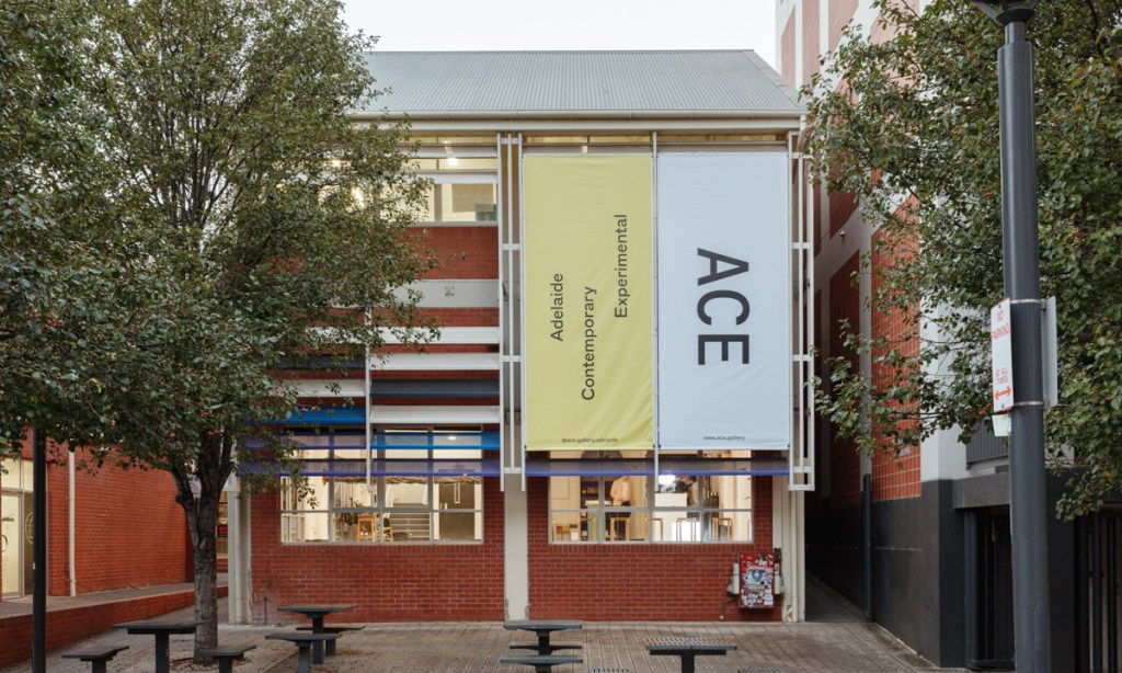
The half a century of detritus belongs to the Contemporary Art Centre of South Australia, established in 1942, and the Australian Experimental Art Foundation, established in 1974. The two entities converged in 2016 to become ACE Open on North Terrace.
In late 2019, a consortium of talented South Australians – including Tyrone, a designer and founder of Person Books – were contracted to help develop a new look for the organisation, including a revised name, website and logo. Officially unveiled in May this year, the entity now goes by Adelaide Contemporary Experimental (ACE).
When artistic director Patrice Sharkey joined ACE Open in 2019, she immediately began conversations with the team about how to expand the remit of the contemporary art centre, beginning with its name.
“One thing that was notable to me, particularly when I was travelling internationally, was trying to introduce our organisation to people that weren’t familiar [with ACE], but we had no context for us to have this shorthand explanation,” Patrice says.
The organisation had demonstrated its openness to the arts community through years of programming experimental and emerging artists, she says. As a result, they removed the word ‘open’ to distil the brand down to ACE – now an acronym for Adelaide Contemporary Experimental.
Courtesy of a $100,000 Arts SA grant, the revamp included a new website, which will help make ACE more resilient to any future pandemic restrictions or lockdowns by having the capacity to house digital commissions and be more accessible to audiences. The site will be a place to showcase art online, including videos and interactive content.
The aim, he says, was to create a platform where information could be hierarchically ordered, and in which accessibility plugins – used by those with auditory, cognitive and neurological disabilities – could operate harmoniously.
“The way the structure of the website was built, it didn’t allow for new things to emerge or new platforms and new kinds of content,” Patrice explains. “Exhibitions are a large part of what we do, but we also run a studio program for five SA artists a year, and that wasn’t prioritised or privileged on the website.
“So now that we understand more about what are the core activities of our organisation, we’ve been able to build an expandable, kind of flexible platform that demonstrates the core parts of the operation.”
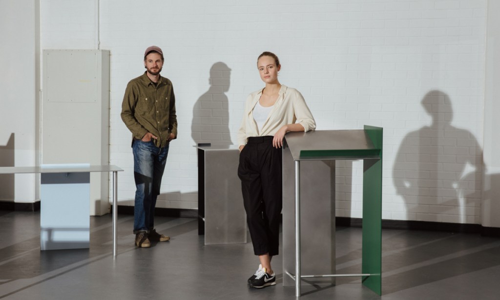
Tyrone Ormsby and Claire Markwick-Smith
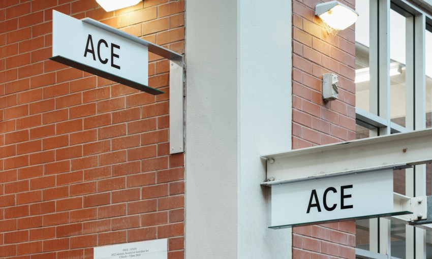
ACE’s new look extends from online into IRL, including interior pieces and external signage at the North Terrace locale from Claire Markwick-Smith.
Claire has already left an indelible stamp on some the city’s most well-known spaces, such as natural wine bar LOC and cocktail venue 1000 Island. She has also conceived what is maybe the city’s most iconic chair.
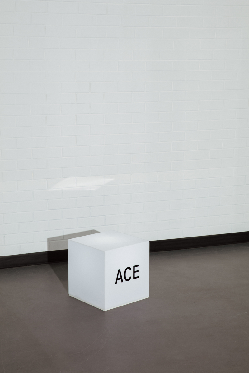
And with a new name, ACE has also debuted a bespoke typeface, bringing a humanistic inky lettering form to the organisation. The typeface, also called ACE, was created by Tyrone and an interstate collaborator, Dennis Grauel. It will be used for internal and external communication from ACE.
Certain characteristics of the typeface design, such as the choice to go sans-serif, came from Tyrone’s time digging through the archives. It wasn’t until after the design process that he realised how much inspiration had seeped into his decision-making for the entire project.
“I thought we’d just riffed on the concept of communication between artists and institution and audience,” he explains
“But instead, I found that I’d actually picked up colours from an old Bridget Currie pamphlet, from I think it was early 2000s. I took the yellow from the front of an old broadsheet in the ’90s.
“It’s kind of like this funny idea that you take something old, and you make it new.”
Share —