

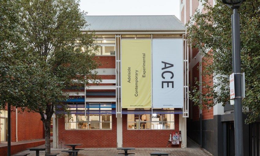
With a new name, refreshed brand identity, and new custom built website, arts organisation Adelaide Contemporary Experimental (aka ACE) is celebrating the start of a new era.
May 26, 2022
Culture
A contemporary arts institution, redefined
- 1
- 2
- 3
- 4
- 5
Adelaide Contemporary Experimental (ACE) Artistic Director Patrice Sharkey says that the former name was an unfixed acronym, which was open to interpretation by its community.
Now, ACE is a self-defined fixed acronym, standing for ‘Adelaide Contemporary Experimental,’ which better reflects the organisation’s standing as a national and international leader in the field of contemporary art.
“In changing our name to a fixed acronym and re-launching our brand, we are matching ACE’s visual language to the energy and maturity of our artistic programming and signalling our special place in the world,” Patrice says.
“While we remain a flexible and responsive space for art and artists, we also know exactly who we are: situated on Kaurna Land in Adelaide, we support and celebrate art that is contemporary and experimental.”
ACE has been built on almost 120 years of history and is the result of the 2016 merger of the Contemporary Art Centre of SA (CACSA) and the Australian Experimental Art Foundation (AEAF).
The new brand recognises and celebrates the ‘Contemporary’ vision of CACSA and the ‘Experimental’ legacy of AEAF in its year-round program of free exhibitions by South Australian, Australian and international artists.
Sharkey says ACE worked with the next generation of talented Australian creatives to create its new identity, including graphic designer and co-director of Person Books Tyrone Ormsby, Adelaide-born type and graphic designer Dennis Grauel, interior and furniture designer Claire Markwick-Smith, and illustrator and designer Jasmin Neophytou.
“From the outset of this exercise, it was important that this project would feed back into the local economy and support local artists and creative industries,” Patrice says.
“I’m extremely proud of the small team of young creative professionals that we trusted to deliver this rebrand for ACE.
“What they have created for ACE is sensitively considered, flexible, playful and evergreen.”
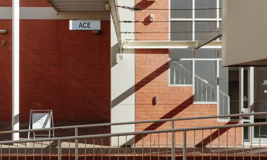
Exhibitions, talks and events are held at ACE’s Lion Arts Centre home in the west of the city, where it hosts a sizeable gallery, artist studios, an apartment for visiting guests, and a multi-purpose retail space.
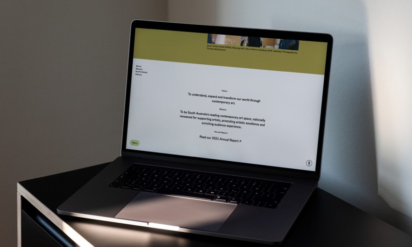
The new website was designed and developed by Person Books in consultation with Adelaide-based web developers, Rockethouse.
Sharkey says it sets a benchmark for accessibility and integration of new technology that will provide ACE with the ability to move deeper into the digital age, to commission and present artworks online.
The site is also fully accessible to accommodate auditory, cognitive, neurological, physical and visual access requirements to create a truly inclusive space.
“We want to ensure that people using the accessibility functions have the same quality design experience,” he says.
Ormsby conducuted extensive research into the archives of CACSA and AEAF for inspiration and, from there, alongside Dennis Grauel, designed a custom typeface called ‘ACE. He says the typeface contains humanistic, idiosyncratic, inky letterforms full of the character and warmth found throughout much of the archive’s printed matter.
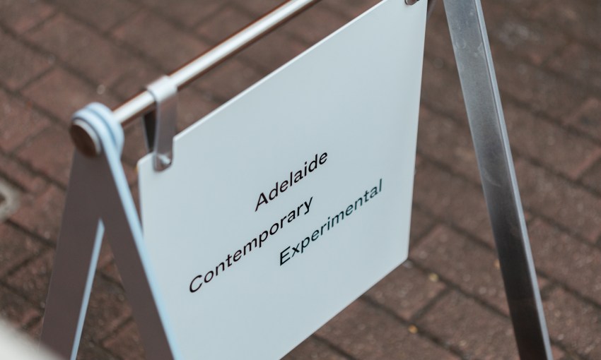
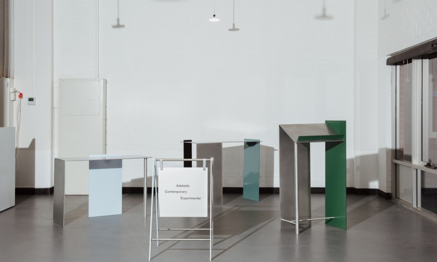
Local interior and furniture designer Claire Markwick-Smith designed ACE’s new signage, and designed and fabricated several pieces of gallery furniture.
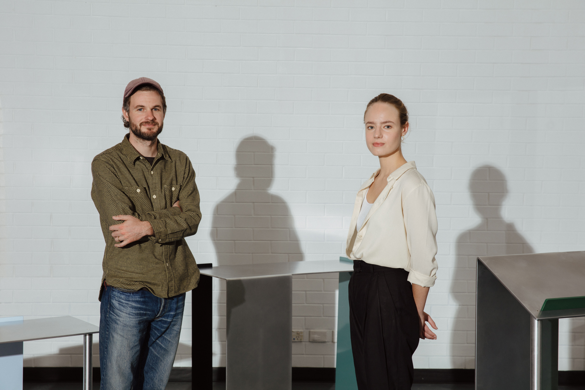
L—R: Tyrone Ormsby and Claire Markwick-Smith. This picture: Jonathan van der Knaap
“I came up with a design for a lectern and a set of display tables that are functional as a merch table, book display or bar,” Claire says.
“Assisting this aspect of the process was the talented team at George Street Studios, David McMurray and Tom Golin, who were instrumental in helping me bring my designs to reality.
“The result is a set of objects based on minimalism, materiality and function – subtracting all but the necessary forms to keep the objects balanced, which I felt speaks to the rebrand effectively.
Claire describes ACE’s rebrand “as clean and adaptable” while also creating versatility among the changing exhibitions and their identities.
“It’ll be great to see how the rebrand sits alongside the future shows and how our work will interact with this,” she says.
Explore ACE’s new website here, where you can find information on current and upcoming exhibitions.
Share —