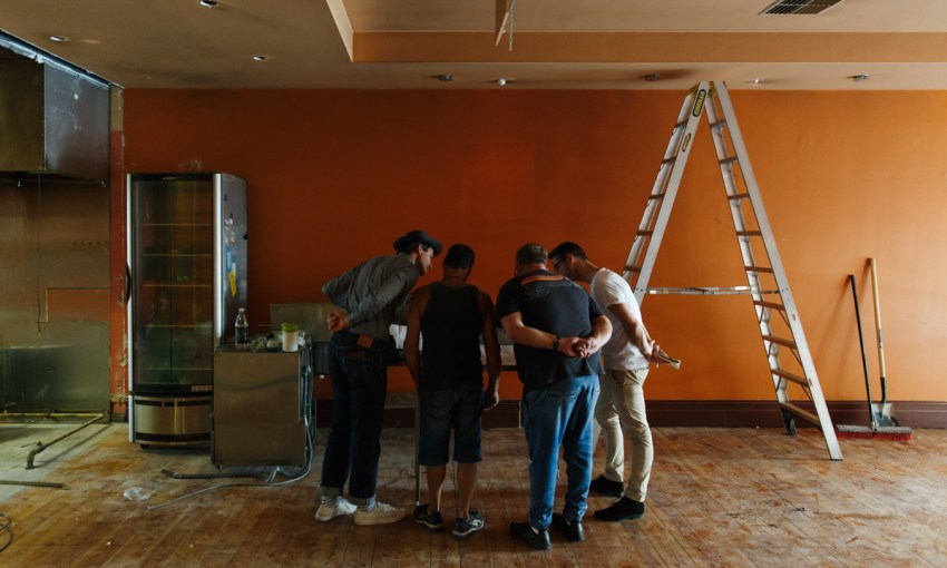
First comes concept, then comes design. Studio Gram walk us through their plan for Leigh Street's next big thing.
How to make a restaurant: Designing Shobosho
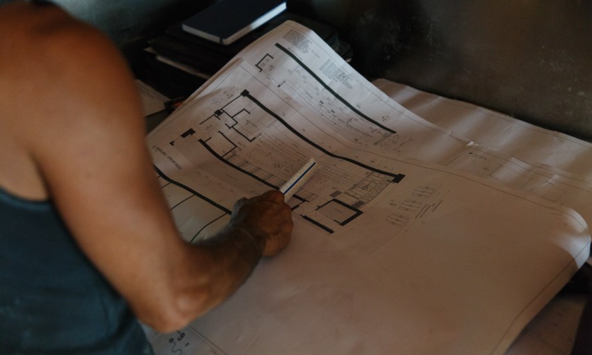
Before the first round of reservations are filled, before the fire line is seasoned, even before the builders are brought in, a restaurant will start life as an idea.
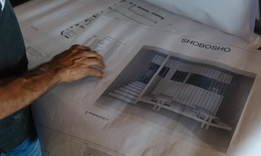
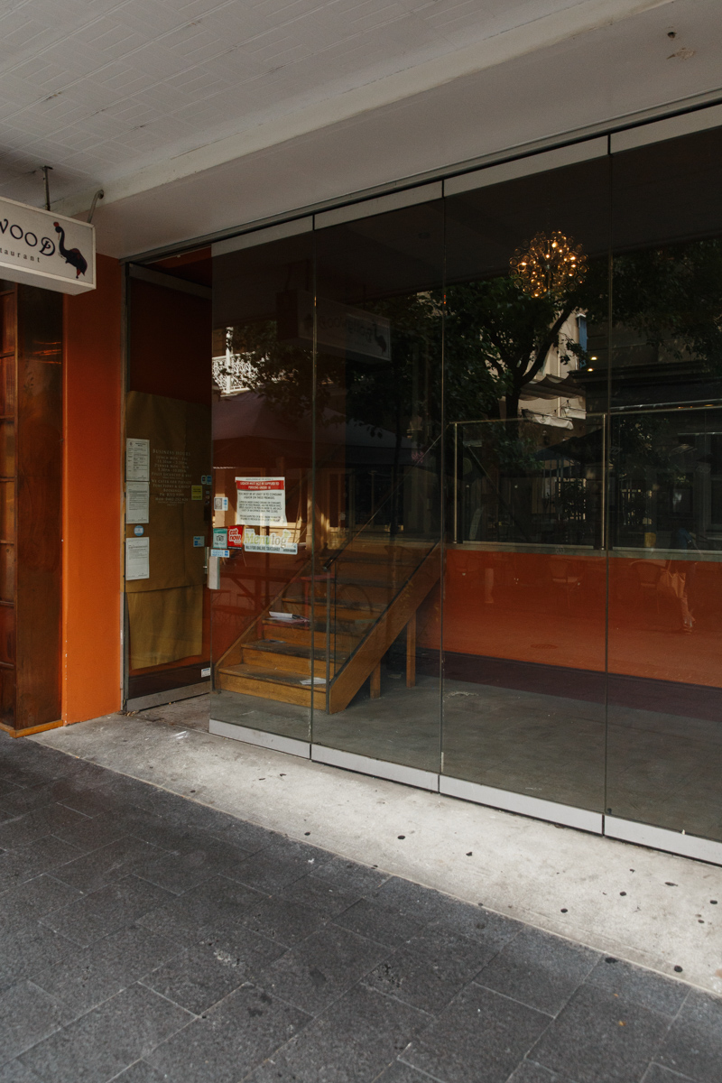
Shōbōshō is set to open at 17 Leigh Street, Adelaide in late March.
The first step toward bringing the concept into flesh and mortar from its cerebral home is to contact a designer, and once Simon Kardachi had a space and a clear idea of what his upcoming Leigh Street project, Shōbōshō, was going to be, his next call was to David Bickmore and Graham Charbonneau at Studio Gram.
Having worked with Simon on his Pirie Street restaurant, Osteria Oggi, as well as on his home and a couple of projects coming up at Henley, the guys at Gram showed no hesitancy.
“He just puts a lot of trust in us, so he hires us for the right reasons,” Graham says.
“He’s got his own opinions, for sure, but anytime he disagrees with us… he just wants a reason for what we’re doing, and if you give him a reason that he thinks is plausible, even if he still disagrees, he’s happy to go with it and trust you.”
Shōbōshō is Japanese-influenced and fire is a predominant theme, but visually speaking, the design was always open to interpretation.
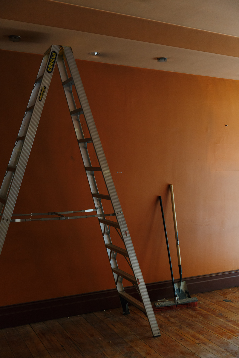
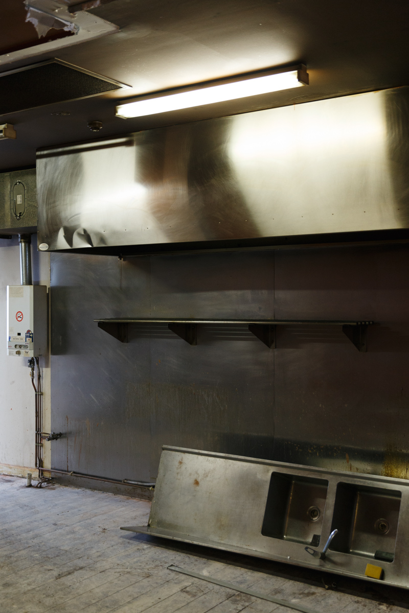
Building is already underway in the space

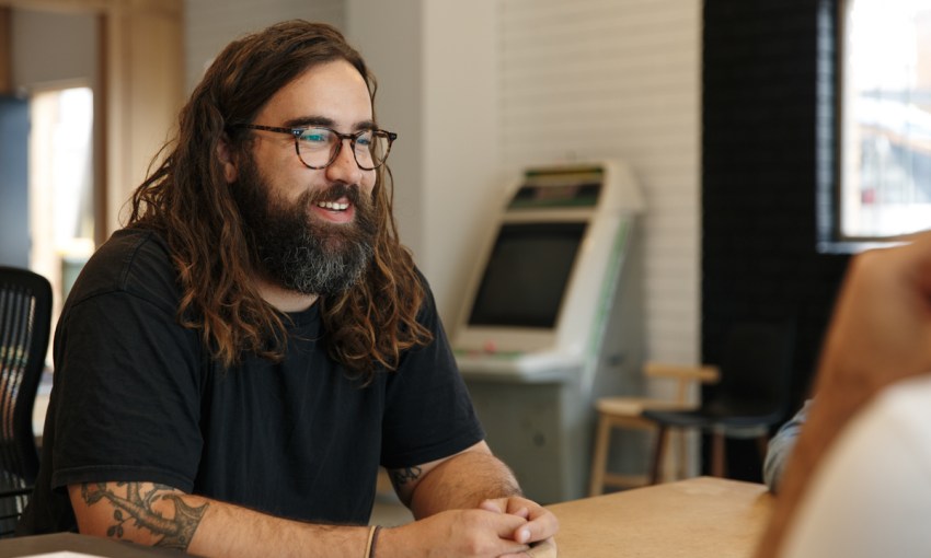
Dave Bickmore – Can smile.
“I think we’ve been more literal with this concept than any of our other projects,” Dave says.
“We work a lot with narrative, and the fact that he’s using fire – we’ve kind of taken that pretty literally.”
The influence of fire will make its way into the design through a custom-built fire line on display from the moment patrons enter the restaurant, and all that will separate people dining at the bar from the kitchen is the bar itself.
“I think the best seat in the house will be this end, for sure,” Graham says.
“You’d be sitting there and there’ll be a chef standing where I am cutting meat and putting it on a plate and giving it to you.”
“We kind of understood that he wanted to put the kitchen on show, which is a big part of Simon’s ethos,” Dave says.
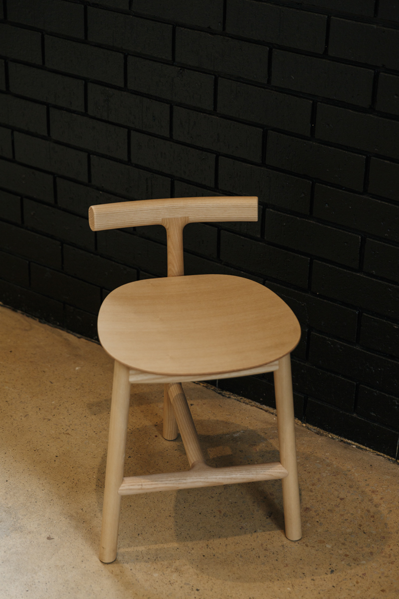
Studio Gram are specifying these stools by Mattiazzi for the interior
When leaving designers alone to ruminate over Japanese architecture, timber and fire, it’s only a matter of time before they start to get experimental. Inevitably, Gram decided to the introduce shou sugi ban to the space, a Japanese technique of treating and sealing timber by applying a well-trained blowtorch to it.
The space itself also threw up some challenges.
In the restaurant’s former life, you were greeted by a set of stairs ahead of you as soon as you entered, and a small waiting bay would sit on your right. It’s an awkward false start that could only be addressed with good design.
“It’s an interesting process to design a place where you’re going to walk in the front door, but you’re not really in the restaurant yet,” Graham says.
“I think getting that entry right was probably the most challenging thing from a design point of view.
“So in that entry we’ve created two booths, I guess, but they’re more like… a take on the traditional Japanese teahouses where you get down into a table, so you kind of get into the floor in a way.”
Dave and Graham also introduced challenges of their own into the space.
“We’ve got a few pendant [lights], and wall lights in the booths, but other than that there’s no lights through it, so we’ve done away with using lights as a design feature, which is something a little bit different for us,” Graham says.
“I think the pendant in bar and restaurant design has been, uh…”
“Has been done a lot, you know? And the exposed globe has kind of been thrashed,” Dave concludes.
As a replacement, canvas screens will be lit like light boxes along the length of the booths on the wall opposite the bar, which will then illuminate the rest of the restaurant.
The proof of that particular design element though won’t come until they test it in the space.
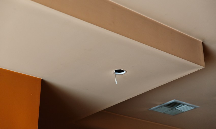
“We’ve definitely made allowances in the ceiling to put lighting in if we have to,” Graham says with a smile.
Whether or not that comes to fruition, CityMag is confident that letting Gram loose on Leigh Street can only result in something great.
“We’re actually really stoked to be doing something along there, just because of the quality of the venues that are around that area, and that challenge that is then imposed on us to create something that’s new and fresh and worthy of being on those strips,” Dave says.
“We’re pretty excited about this one.”


