

Along with this year’s Rio Olympics will inevitably come the disappointing mascots. Since we’ve always wanted to run a list of bad mascots, we’re using this as a vaguely relevant excuse to present the below.
March 29, 2016
Culture
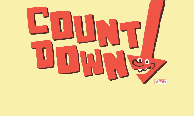
10 best worst mascots of all time
10. Speedy the Geoduck (Evergreen State College, USA)
Few people have ever seen one of these horrific abominations slithering free in nature. That said, it probably would not have killed the costume designer for Speedy the Geoduck to hit the Encyclopaedia Britannica for some visual reference research before whipping up this mascot suit, which more closely resembles a faecal taco than it does a real geoduck. Remarkably, the former is still far more appealing to behold than the latter (which really is quite awful).
9. Elvis J. Eel (Southend United Football Club, England)
As far as mashup ideas go, marrying Elvis Presley with an eel ranks right up there with marrying bleach with ammonia. Perhaps the only saving grace is that this mascot was a replacement for a still more horrifying abomination named ‘Sammy the Shrimp’; the shrimp of course being the only creature with even less reason to be near a soccer pitch than an eel or Elvis.
8. Otto Orange (Syracuse Orange football, USA)
There is a complex and satisfying historical reason that a clumsy-looking orange man is the team mascot for Syracuse University’s football team, but unfortunately said historical account is nine paragraphs long on the University’s website. We trust that the reader agrees that nine paragraphs of text is quite simply too much for this author to wade through in service of writing a disposable comedy column in a free quarterly periodical.
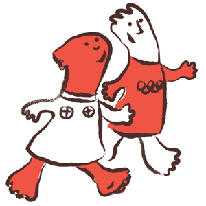
7. Athena and Phevos (2004 Summer Olympics, Greece)
We of all people can appreciate a sophisticated visual allusion to 7th Century BC Greek terra cotta daidala idols when the context is appropriate – but a cartoon mascot design for children is not one of those contexts. Instead, these two characters look as if the mascot designer accidentally left their sketch pad on a bench at the zoo and a tapir took to sketching with the pen in its trunk thing, while all the while a violent earthquake happened to be taking place. Apparently, the designer then returned to their sketch pad, surveyed the inept scribbling, said ‘good enough’, and went to eat a lamb yiros (it being Greece).
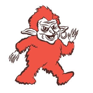
6. The Gobbledock (Smith Chips, Australia)
This idiot is going in here simply because it haunted the dreams of the author’s childhood. In fact, the porcelain-faced, mange-furred Gobbledock appears to have been designed solely for the purpose of haunting small children’s dreams, with the sale of potato chips a secondary thought at best. Well, nuts to you, Gobbledock. After staring at you for 30 minutes to render the above cartoon, I can now state that you’re not even that terrifying. Still, please don’t eat me.
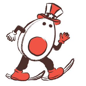
5. Hantama-kun (Hunter Mountain Shiobara ski resort, Japan)
At an extreme stretch, making a sliced boiled egg the mascot of a ski resort might make sense. After all, what do you want most of all after an intense day spent shredding the powder? Something warm, something nourishing, something healthy: a half a boiled egg. Sure. What makes absolutely no sense and is literally impossible to rationalise, however, is why said egg should be wearing an ‘Uncle Sam’ top hat. That, dear reader, is pure madness.
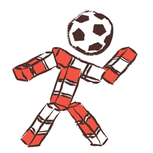
4. Ciao (1990 FIFA World Cup, Italy)
While other World Cup hosts have elected to create mascots that are somehow country-specific, the Italians cheerfully thumbed their nose at this highly logical practice, and instead went with a mascot design that consisted of a collection of brightly-coloured cubes arranged in a vaguely human shape. When your country is ready-shaped like a giant soccer boot punting Sicily out into the Mediterranean, how you end up with this thing as a mascot is a mystery for the ages.
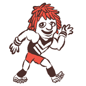
3. Johnny “The Doc” Docker (Freemantle Dockers Football Club, Australia)
Although we were enormously tempted to nominate that lightning bolt thing that Port Power keeps around as the worst mascot of the AFL, that’s at least a semi-creative idea. But there’s no excusing Freo’s “Johnny “The Doc” Docker”, who is just some dude who looks as if he would be too busy listening to crunkcore to ever put in an honest day’s graft at the docks. Here’s an idea: if your mascot is just going to be some dude, cut out the middle man and just make the dude inside the costume be that dude. You have now saved $90 on an inept mascot suit.
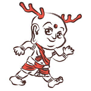
2. Sento-kun (Nara, Japan)
When the good people of Nara needed a mascot to help celebrate the 1,300th anniversary of their city, the solution was obvious: they needed a fat baby with antlers. Despite some initial grumbling from dedicated haters (who believed that a fat baby with antlers is an awful way to promote any product on Earth) the mascot – Sento-kun – went on to be wildly popular. Today, you ladies can even buy a purse in the shape of Sento-kun’s head, should you ever feel the need to stow your tampons inside a fat-baby-with-antlers-shaped receptacle.
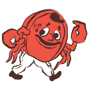
1. Crazy Crab (San Francisco Giants, USA)
Crazy Crab was designed to be a mascot so inept and hideous that fans would rally around their collective loathing like a glorious lightning rod of hate. Through their disgust, they would cheer as one. But the good-natured fun turned serious when spectators began to regularly lob beer bottles, batteries, and urine-filled water balloons at the crustacean. Things escalated even further when two San Diego Padres players violently tackled Mr. Crab, resulting in a round of back injuries and lawsuits. With that, the mascot suit was hastily stashed away, and the Giants’ experiment with an ‘anti-mascot’ came to an abrupt end. Ultimately, the plan to craft a hateable mascot had worked too well.
Share —