

Designing the branding and collateral for an exhibition that displays the very best of contemporary Australian art is a daunting task.
March 7, 2016
Commerce
The magic of objects
- 1
- 2
- 3
- 4
This year is the second time creative director Jason Hollamby and art director Joel van der Knaap have been tasked with the intimidating job of creating an identity for the Adelaide Biennial.
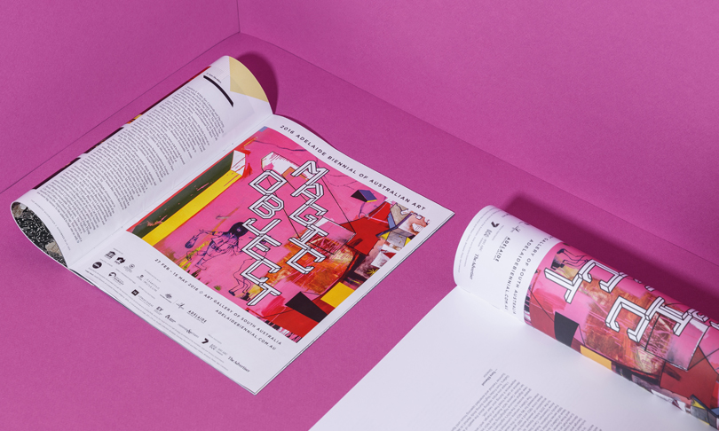
The exhibition, which acts as a survey of Australia’s best contemporary art, is held by the Art Gallery of SA every two years and each incarnation invokes a different theme. This year’s – Magic Object – is a joyous exploration of materiality in art, and stands in stark contrast to 2014’s bleak Dark Heart.
Remarks
Magic Object will be on show from February 27 to May 15. In addition to the exhibition at the Art Gallery of SA, works from the Biennial will be shown at the Anne & Gordon Samstag Museum of Art, JamFactory, Carrick Hill and The Santos Museum of Economic Botany in the Adelaide Botanic Garden.
For Dark Heart both Joel and Jason worked with the Art Gallery through agency Clemenger BBDO, but this time around it was their pitch via current employer Cummins&Partners that got them the job.
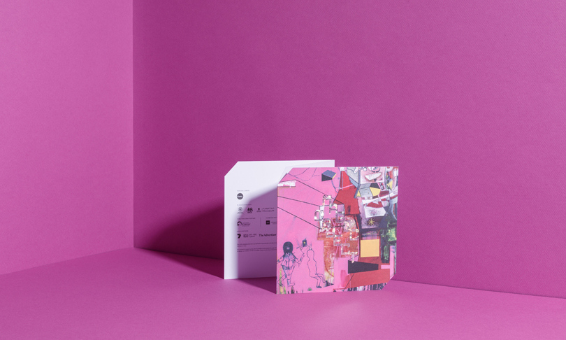
The purpose of the identity and its manifestations – which include everything from the brand mark to a comprehensive media kit, suite of invitations, press ads, posters, a web presence and tram wraps – was to communicate the message of the exhibition itself, but with one key consideration.
“It’s a really interesting thing because usually you’d be dealing with client-designer-client-designer, and then you’ve got the audience,” says Magic Object curator Lisa Slade. “But for us in the art world we feel very heavily on our shoulders the weight of responsibility to the artists.”
“These guys totally get that. The designer doesn’t trump the artist and they understand the gallery’s relationship with the artist is the most important thing for success.”
Faced with the task of communicating the message of the whole exhibition using imagery from individual artists, and being careful not to diminish those works, Joel and Jason dug deep into the thinking behind Magic Object.
“That was definitely our starting point – the idea that any object has magic for someone,” says Jason.
“Everyone has a drawer or a cupboard or a box of things from their life that no one even has to see, they just have to own those things because they have some sort of existential pull that allows them to transport themselves back through time or imagine their objects being passed down – it almost gives them a sense of immortality.”
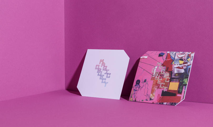
Joel spent a lot of time working out how to translate this sense of an object’s magic into imagery. Starting with typography, he set about sketching something that was almost multi-dimensional.
“I wanted that feeling it’s going this way and coming that way and you can perceive it differently,” he says. “I was working on that, but I actually ended up finding a typeface that had been developed that was doing a better job than I had been doing. I still had to tweak it a lot to get it to a place I was happy with.
“The idea of adding that extra level of being an object meant I wanted it off the straight lines and put it on this stepped sort of layout – we wanted to challenge people, to draw them in, but not to the point of it being unreadable.”
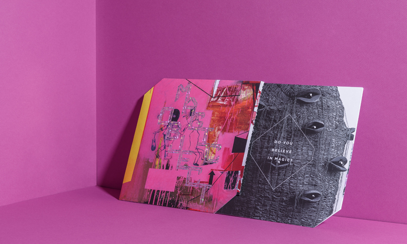
Conjuring the feeling of an object was also a strong consideration when making collateral like the media kit and opening invite, which feature a painting by Biennial artist Gareth Sansom as a flagship image.
“The media kit, for instance, needed to feel like someone thought it was quite special for some reason,” says Jason.
“Shape, I think, is one thing that does that,” says Joel – pointing to the cut-out corners and almost square format of both the invite and media kit.
“And I do think the Gareth image is so striking and… just laying this typography over the top – there’s a really interesting juxtaposition of different materials, shiny vs textured paint, that makes you want to pick it up.”
Works from other Biennial artists are also sprinkled throughout the designs. Rather than attempting to find similarities and make them work together, Joel decided to accept the differences and make his choices based on ability to convey a specific message.
“I’m more worried about these images doing the job of explaining things that, in essence, give you an encapsulation of what it is all about. This is the nice thing about working with the Art Gallery, if there is a bit of tension between the imagery, they understand and don’t see it as a bad thing,” he says.
The results are intriguing, full of life and take some time to properly understand – qualities that accurately reflect Magic Object itself.
Share —