

The Wheatsheaf Hotel and the associated Wheaty Brewing Corps are tightly-run and smart operations, defined by their distinctly local, casual character. Designers Freerange Future have translated this into branding collateral with uncanny precision.
December 30, 2015
Commerce
Smart casual

- 1
- 2
The Wheatsheaf Hotel might seem laidback, but the team responsible for cultivating that image certainly can’t afford to be.
The iconic Thebarton watering hole keeps designer Amy Milhinch and the rest of the Freerange Future team very busy indeed – but luckily for them chewing the fat while enjoying the pub’s famous beers is an essential part of the job.
First they were faced with the task of rebranding the pub; then came the website and app; and after that was the launch of attendant brewery the Wheaty Brewing Corps – complete with its own dedicated website, which needed to maintain the informal vibe of the Wheatsheaf’s branding whilst establishing a unique identity of its own.
Even with all that done, the work continues, and Amy is forced to keep pace with the fanatical experimentation of the brewing team.
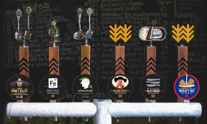
In just a year and a half, the Wheaty Brewing Corps has produced over 50 different types of beer – more than most breweries manage in their entire existence – and for Amy each new variety means the design of a unique label.
“…we are taking the beer seriously, but not taking ourselves too seriously.” – Jade Flavell
Amy says the design ideas often come about via a kind of “reverse-brief” where she approaches the Wheatsheaf publicans – Jade Flavell, Liz O’Dea and Emily Trott – with ideas based on casual conversations they’d all shared about each brew.
“We talk to each other, sit around a table, quite often I do a bit of listening – a little bit,” Amy laughs.
“Because we bargy over things, there’s sometimes a bit of toing and froing.”
From the client’s perspective, Jade believes both the design process and the outcome are “identifiably Wheaty”.
“The same sense of humour and irreverence, but with great attention to detail,” she says.
“The artwork is taken seriously, but we are not taking ourselves too seriously, we are taking the beer seriously, but not taking ourselves too seriously.”
The brewery branding carries an air of nostalgic modernist Americana, as informal as the chalk-on-blackboard ramblings that define the Wheatsheaf’s image, while at the same time remaing distinctive as per the brief.
The individual varieties only stick around for a short while – Jade says they’ll often brew around ten kegs and be done with it – but on the Wheaty Brewing Corps website each beverage remains forever, with a picture of the beer’s label accompanied by comprehensive tasting notes.
Jade says the descriptions can often “draw a long bow” and the names – highlights include “Non Corps Promise” and “The Claw” – are oftentimes obscure, so the design of each label does the essential work of tying the name and tasting notes together and conveying the tongue-in-cheek undertone.
The logo for the brewery is made up of two stylised stalks of wheat, branching off into three lines that form Ws – evoking the name of the associated pub, the three publicans that run it, and the three stripes of a sergeant, as per the “community military” feel the Wheaty Brewing Corps team envisioned.
Of course, plenty of work has gone into the branding for the Wheatsheaf itself, as well.
The hand of co-publican Emily Trott plays a central role in this, with her writing used as the basis for the blackboard text on the website and app.
A font was even created based on Emily’s handwriting to allow digital type-ups, but generally she simply writes out content the old-fashioned way and scans it so Amy can “work her magic”.
Emily confirms that the casual branding is very much in keeping with the Wheatsheaf’s physical presence.
“It’s clean and tidy whatever, but it’s also a bit crap,” she says.
“Look at the chairs, they’re a bit crap – every element of our design has to reflect that.”
Jade prefers a slightly different term.
“The core essence is crap-tastic,” she says.
“It takes a lot of work to do crap-tastic well.”
Share —