

Tony D’Angelo has spent his career aiming to roast a coffee bean that pours perfectly first time, every time. He needed a brand that reflected his passion for this simple version of perfection, so he called in Sherpa Design.
May 29, 2014
Commerce
Perfect simplicity
After 26 years of roasting coffee beans for others in the coffee industry, Tony D’Angelo decided it was time for him to do things his own way. In 2010 he struck out on his own and D’Angelo Coffee was born.
Since then, Tony has been working collaboratively with Sherpa Design to build up branding elements that visually represent his passion for the craft.
Sherpa is owned and run by Kim and Natalie Seppelt-Deakin, who originally met Tony through mutual friends. But it was Kim and Natalie’s other business – letterpress service The Ink Room – that Tony was first keen to work with.
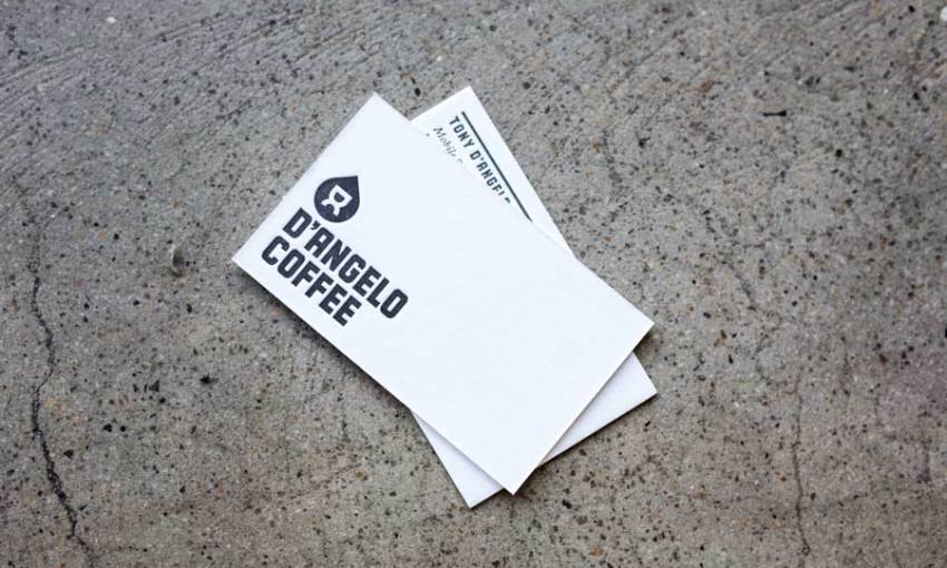
“Initially, Tony was attracted to letterpress because he loves the hands-on nature of old machinery. He wanted letterpress business cards,” says Kim.
Sherpa then began talking with Tony about a more involved branding design process.
“We did sit down quite a bit, in terms of him showing us the kind of style that he liked,” says Kim. “He had a good understanding of what needed to happen so it wasn’t a difficult process.
“I think it’s about showing that you listened to them (the client). Our process is to show the journey of how we then arrived at their logo,” says Kim.

Tony’s coffee is of the highest quality, so the branding was designed to reflect that.
“Tony likes the simplicity of things, and that’s what brought about the logo in terms of creating something quite simple, which reflects his vision,” says Kim.
Details about the man and the business – the quality of the product, Tony’s heritage, his character – all influenced the design and was packaged into one concise logo.
The central element of the logo is the initials of D’Angelo Coffee (DC). When turned on their side, the initials also represent the portafilter from a coffee machine, creating extra depth in the significance of the logo.
The black coffee-drop background in which the white DC initials rest was inspired by the process of brewing the first cup of coffee from a batch of freshly roasted beans.
“You know whether it’s going to be good from that first pour. That’s all Tony works for; that first drop,” says Kim.
“We’ve worked with him for the last few years, it’s something that’s constantly evolving. We’ve had to move with the growth of the business. As more cafès stock the beans, we create t-shirts and signage for those cafès.”
For the brand’s supporting typography Sherpa selected a typeface created by Letterbox that references Tony’s
Italian heritage.
“We chose this typeface because when we were doing our research of old vintage Italian posters and packaging, it reflected that visual style,” explains Kim. “I guess it also has that industrial feel; which connects to the machines that Tony’s using, so it’s quite a strong typeface which reflects his personality.”
D’Angelo Coffee’s roasting plant and storefront is situated in a warehouse in Thebarton. Most of their product goes out to cafès and restaurants including Nano, Caffeteca, Etica, Press*, and The Pot.
The roasting process is hands-on, and the packing is also done manually.
To illustrate the physical nature of the process, Sherpa commissioned a mural that adorns the wall inside the little shopfront of the Thebarton store.

“We got local artist Joel van der Knaap to do a mural in the shop; a visual representation of the roasting process – from picking the bean, to roasting it, then drinking the coffee,” says Kim.
Sherpa’s ongoing branding work has been well received.
“When Tony does talk about us to other people, he mentions that we really listened to what he wanted, so I think that’s one of the reasons why we ended up with the great result,” says Kim with a hint of pride in their work.
“That’s always a bonus when people say that it really works. You know it’s working because the business is growing.”
Share —