

The refreshed graphic identity for State Opera of South Australia and its multi-coloured program for 2019 is a tool for the organisation to leverage in their quest for new and more diverse audience members.
January 29, 2019
— The Design Issue
Opera for all: Expanding the State Opera brand with design
State institutions bear the weight of expectation other companies do not.
Tied up in heritage and history and necessarily engaged with their passionate membership, change can come slowly to South Australia’s hallowed arts organisations.
Remarks
Explore the State Opera program here.
However, a recent brand refresh by State Opera caught our attention as a particularly good example of a how cut through can be achieved without causing too much consternation.
“It’s like a stylish new hairdo,” says Sidonie Henbest, creative producer at State Opera and the driving force behind the new identity.
“In the same way a new haircut can accentuate the existing features of a face, this brand refresh is about bringing out the natural qualities of our organisation and not changing what it fundamentally means to people.”
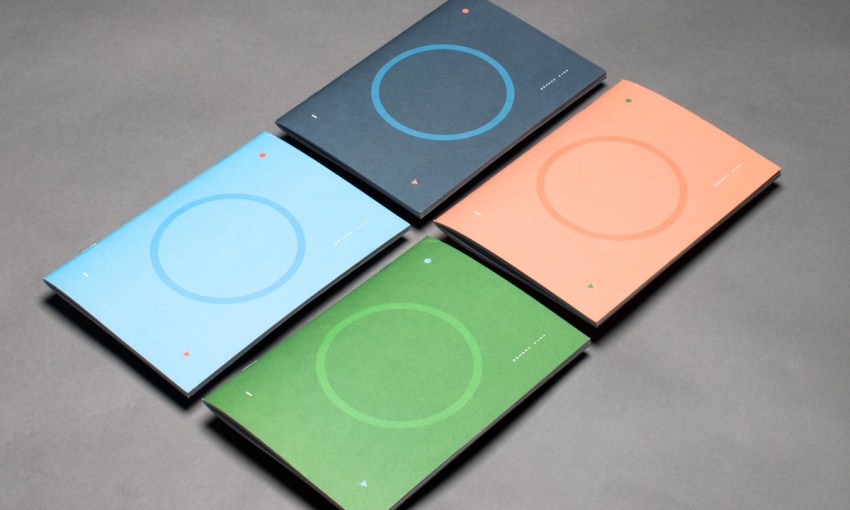
The new brand features the same dominant ‘O’ that has been present in State Opera’s identity for the past decade, but updated to make sense in 2019, Sidonie explains. The iconic ‘O’ has been re-imagined (inside the organisation at least) as a “lifesaver”.
“You know those little multi-coloured candies?” asks Sidonie, unsure if they are still available in stores. The purpose behind the different colours of the 2019 program is to disrupt existing preconceptions about the institution and engage with a broader cross-section of the community.
Remarks
State Opera’s new brand identity was created by Sydney design firm Novel.
“We wanted to give people permission to relate to us in different ways, the simplest of which is the idea that you can choose your favourite colour,” says Sidonie.
Choice is a key tenant of the new brand and marketing behind State Opera. The organisation has done away with pre-packaged ticket options and is allowing its audience to pick and mix whatever events they want, in order to gain the savings of a multiple ticket purchase.
Great branding does more than turn heads; it sets a tone and creates expectations the company must then fulfil. It’s pleasing then – more than just a lick of paint – that State Opera’s new brand is connected to positive, organisational changes too.
Share —