Local designer Sean Kane took Paul Serafin’s vision for a New York Jewish style Deli nestled in North Adelaide’s leafy residential streets and created a brand with a clean aesthetic accented by subtle traditional influences.
New York in North Adelaide
Sean Kane is known for his custom typography, while his client Paul Serafin is known for his custom sandwiches.
Together they have customised the concept of a traditional NYC Jewish Deli just enough to make it work for the Adelaide market.
See Sean’s work in person at The Flying Fig Café –
161 Jeffcott Street,
North Adelaide.
Located a little past Wellington Square in North Adelaide, Paul’s new venture – The Flying Fig Deli – occupies a historic stone corner frontage and has been developed specifically to service locals.
“Yeah I didn’t want to wave the American flag… I didn’t want to go and do all that sort of thing,” says Paul. “The Jewish delis over in the States don’t wave the flag – they’ve matured over there… so I did say to Sean, just keep it subtle.”
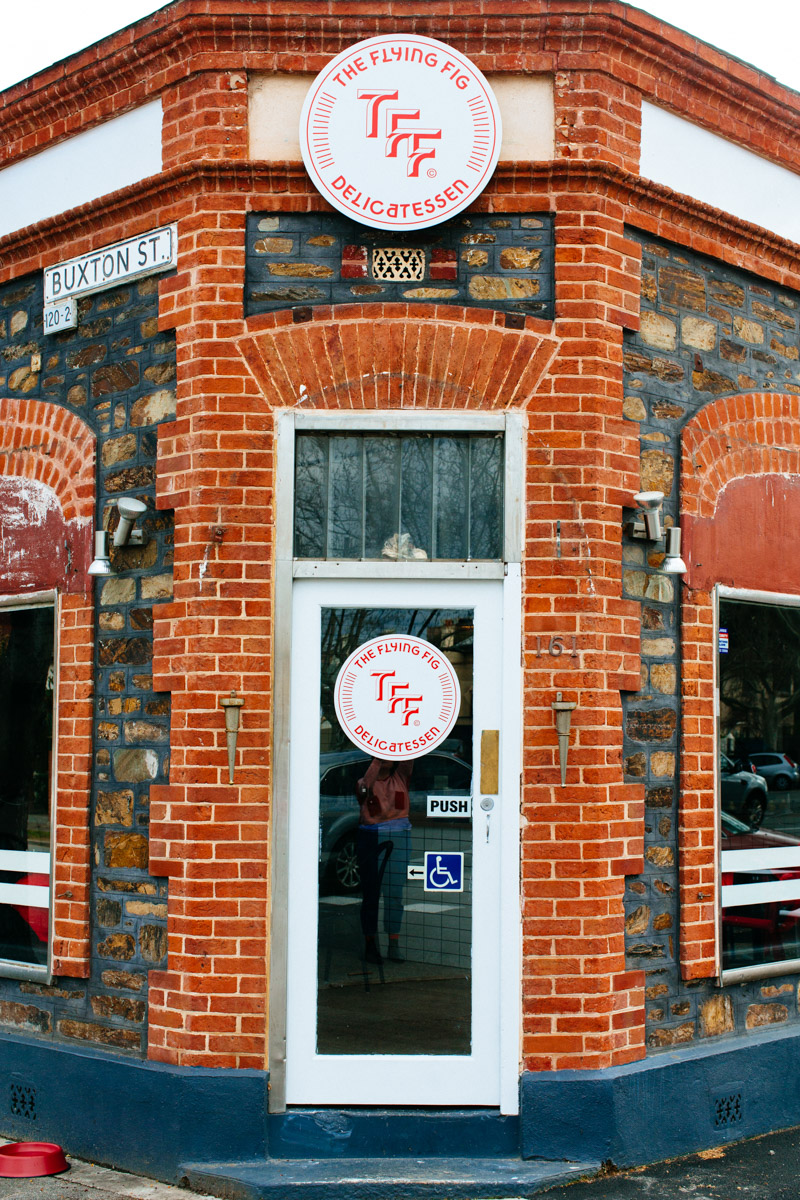
The form of the building has influenced Sean’s treatment of the brand
Sean’s solution to the conundrum of an eatery that was inspired, but not enslaved, by an existing visual style was to see how he could incorporate old elements of deli symbolism into a brand that looked entirely contemporary.
“I kind of studied the Hebrew alphabet a little bit,” says Sean.
“I mean I don’t understand the language at all – but I just looked at how the shapes of the letters worked and it was a combination of a curve and very sharp angles.
“So it [the typeface Sean created for the brand] is about 50 per cent curved letters, 50 per cent hard edged. And these kind of little kinky bits here, if you look at the some of the characters and that sort of thing, it was about making Latin alphabet look like a Hebrew alphabet, but without looking hand drawn either because I wanted it to still look like an off-the-shelf type-face.”
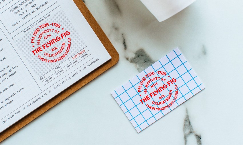
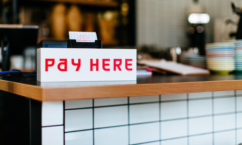
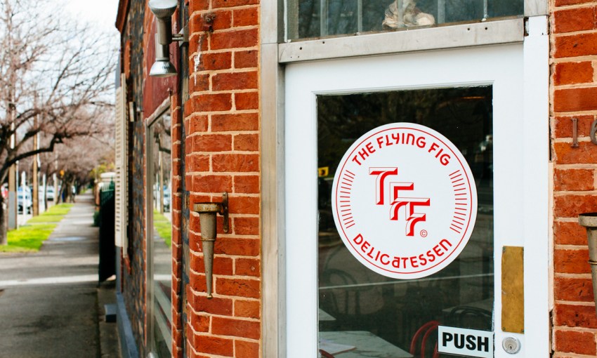
Sean’s branding covers menus, signage and business cards throughout The Flying Fig. A huge expression of it – an emblem hewn in black and white tiles over a feature wall – is also featured as part of the venue’s interior design, which was executed by Designthink.
While the tiled wall is black and white, other branding examples make good use of Sean’s colour palette, which – although it features red, white and blue – is not intended as a nod to Americana.
“The American red, white and blue was a pretty obvious solution, and I didn’t start with that at all,” says Sean.
“I actually started with a red – I thought the red was really nice and I wanted a lot of white, because it has that clean modern feel, and that comes back to the tiles and the interior as well. And then the powder blue was just a nice secondary colour to incorporate.”
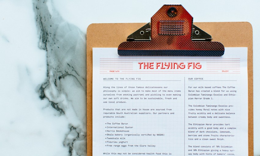
Shades of Sean’s idiosyncratic style can be seen in the graphics too. As well as the typeface being custom-made, there’s use of visible grids across the menu – something that is beginning to become a trademark of sorts for Sean.
Sean says the grid is a nod to his modernist tendencies, but that it also has a practical purpose in the case of The Flying Fig.
“It comes down to a little bit of a diner influence,” says Sean. “It’s not un-designed, because it’s been designed very well, it’s just been designed in a different era.
“I guess the perfect example is a waiter’s notepad that you would get in a sort of small town diner in the middle of America – it’s probably the same design they’ve used for forty years, where you mark off the seating arrangements, you write the price on it, it serves as a cheque, it just does a great job of what it’s doing.
“I wanted to bring that into it a little bit, so that’s kind of where the grids came in. It works as a baseline grid for the type [on the menu] and it separates the items. It lends itself to the menu changing too… so it’s practical in that sense.”
The methods specified for the printing of the café’s menus also recall the simple and unchanged-for-decades visuals of a small town diner.
“That’s risograph printed, and as far as I know, no one is doing it in Adelaide,” says Sean.
‘It’s like a ’80s Japanese Xerox kind of machine and it’s essentially a screen printing ink… It’s got a weird sort of retro-y vibe.
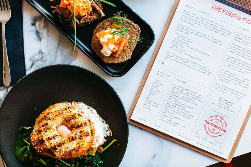
The risograph-printed menu, and some of the delicious things that appear on it
“I don’t really like forcing character or fake textures into my digital work because I think the computer’s made to make things perfect. I like the printing, so that’s where the little glitches come into the work.”
It’s a thoughtful approach to a well-thought-out business, and the result makes something inspired by New York feel right at home in North Adelaide.
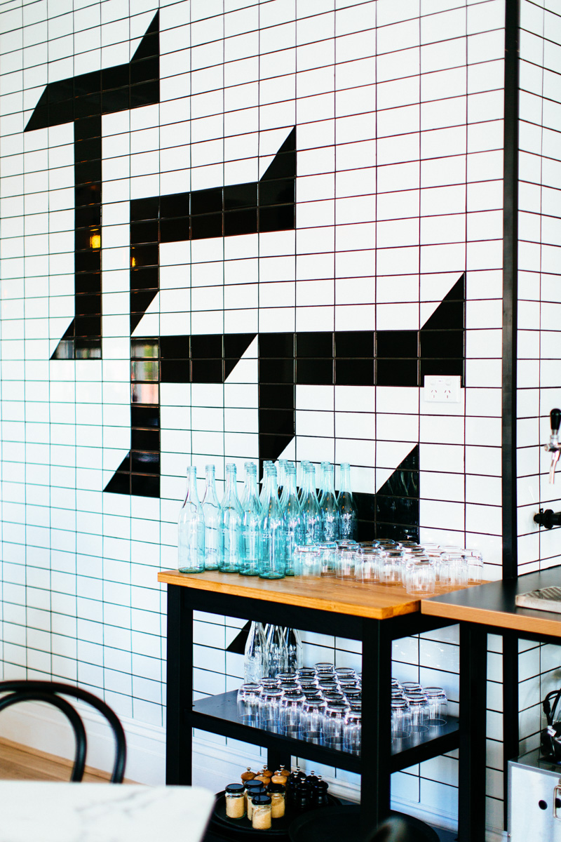
The tiled version of Sean’s logo occupies a whole side wall


