

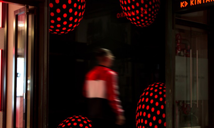
Kintaro Sushi – at the corner of Leigh and Hindley Streets – is an aesthetic revelation, seemingly popping up overnight it revealed both a brand new place to eat delicious, delicious sushi and a design agency we had never encountered before.
January 11, 2019
— The Design Issue
Konnichiwa Kintaro
- 1
- 2
Simple is an integrated design agency working across design, web and advertising that has worked for an impressive and growing list of clients for more than a decade. We found it hard to believe we hadn’t heard of them, but we’re glad Kintaro Sushi on Hindley Street was the project that introduced us.
The Kintaro identity is, at its core, a problem-solving project. The company came to Simple’s creative director Pasquale Parisi five years ago.
“We were approached by the client seeking consultancy ahead of them entering an ambitious expansion phase with their business,” says Pasquale.
And Kintaro came to Simple with very little in the way of existing collateral. “They had their name,” says Pasquale. “The rest of their brand identity was unrecognisable to what it is now – think sumo wrestler clipart.”
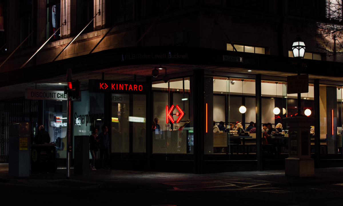
Hindley Street Provided an opportunity for Simple to further push the brand. Faculty Design brought those ideas to life in the shopfit.
Kintaro also had difficulty in communicating to the public what they offered – conveyor belt sushi plates. The term “sushi train,” while widely understood by consumers, is trademarked to their competitor, and Pasquale agreed with his client that “‘conveyor belt sushi’ just didn’t have the same ring to it.”
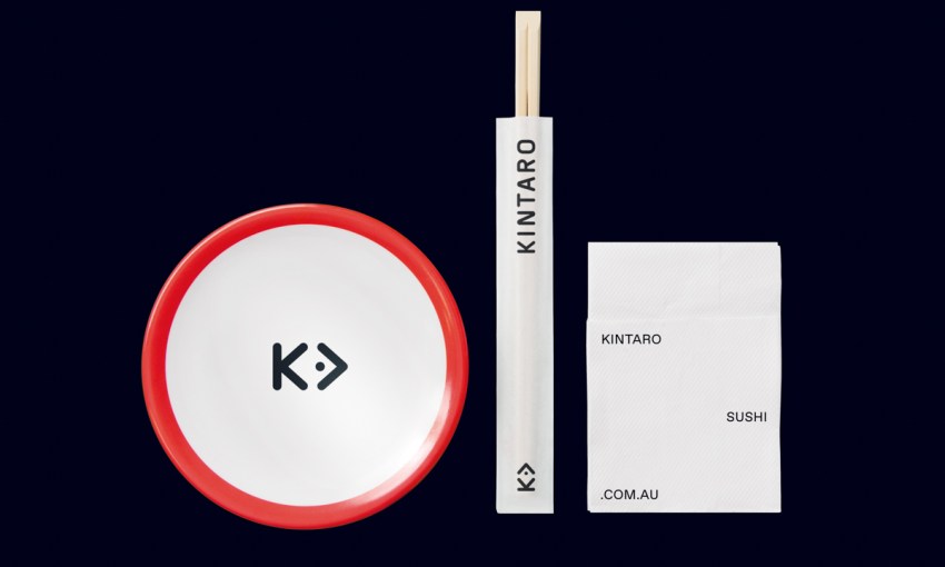
The shop at Hindley Street features some elements of the original work Simple did for Kintaro but is now fully integrated across multiple mediums, including signage, crockery, amenities and other elements of the fit out.
Michael Cervelli was a lead designer on the Kintaro brand at the Hindley Street location. He says this project perfectly articulates the Simple philosophy.
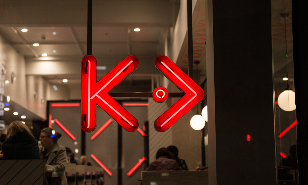
After Simple had spent four weeks developing the brand, ready to present to client, Pasquale traced out the letter ‘K’ for Kintaro on the shower screen one morning. He added to this an arrow to represent the conveyor-belt motion and realised that – together – they formed a fish symbol.
“We feel as though the future of design is venturing into innovative territory where all points intersect: brand, technology, social, digital, environmental,” he says.
“That’s an exciting prospect because we’re no longer thinking about the here and now of a brand but what it will be and how it will exist in all these areas.”
Having a good client is always the true key to success though.
“Ever since our first meeting,” says Pasquale, “the Kintaro team has been completely trusting of our strategy and direction. Their constant openness to new ideas means we’re always pushing ourselves to deliver the best work we possibly can.”
Share —