

At a small stand in the old Central Markets in 1957, Lucia Rosella began business making pizzas from an old family recipe. Three successful generations later, the now iconic family-owned business, Lucia’s, joined forces with Mash studio to create the charming Charcuterie.
February 27, 2014
Commerce
Deliciously designed
Lucia’s owners initially approached Adrian Stevens, director of Interior Pty Ltd, and a long-time customer of theirs, to create their new space.
However, having worked with Mash previously, and seeing an opportunity to create something memorable for the historically significant family business, Adrian called in Dom Roberts, creative director of Mash Studio.
“He didn’t want to just whack something together and be done with it, so he introduced me to Simon at Charcuterie and we started chatting from there,”says Dom of his first contact with the project.
“Simon was really good, I think he trusted our judgment. We’ve found the jobs that seem to go better are the ones where the clients give you a bit more freedom.”
Speaking of freedoms, Adelaide Central Market regulations meant the owners couldn’t just build another identical Lucia’s store – market policy prevents a single entity from taking over too much space in the markets. So the owners needed to create something aesthetically removed from the look and feel of Lucia’s.
That’s where the branding concept of Charcuterie arose from – the need to differentiate from its surroundings. The name, and the type of high-quality produce the store would stock, had already been decided, providing the initial parameters within which Mash could work their mystical design mojo.

The only way to make cheese better is by giving it nice packaging
“So it probably started out looking more at the branding at first, but for us the branding and interior sort of came together, became the same thing,” says Dom.
The interior space and branding needed to convey a sense of specialism and of contrast, but with a welcoming air.
“We wanted it to almost be a place where you would look at it and you would want to walk in just to check it out. It was more about creating this special place.”
Inspiration came from a variety of sources. The flawed beauty of hand-crafted typography, traditional French signage and the interiors of traditional French and Italian food stores.
Mash designed everything in sight; from the furniture, to the copper detailing on the fridge shelving, to the labelling on Charcuterie’s own products.

Everything from labels to signs to stickers were considered
The visual language culminates in the spectacular design of a huge gold-leaf Charcuterie sign to be perched high on the western wall.
“In the end we came up with this beautiful, handwritten, almost old-school, slightly industrial font, and then this huge glass sign that’s really ornate, really detailed,” says Dom.
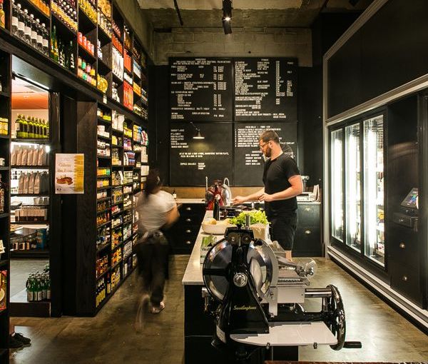
On one side of the store is a wall of produce tucked into shelves, floor to ceiling, in a space-saving nod to the pioneering culinary family’s European heritage. On the other side is a veritable wall of fridges nestled in a custom-made grey steel framework, stocking high-end cured meats, and hand-made cheeses, sourced from both international, and local producers.
“We got little ceramic signs that say what’s in each fridge. They’re pieces by Gerry Wedd, a ceramics artist, an Adelaide guy, we’ve worked with him on quite a few things,” says Dom.
“They’re hand crafted, and that reflects what the products are all about.”
Mash designed everything in sight; from the furniture, to the copper detailing on the fridge shelving, to the labels on Charcuterie’s own products.
An acid-etched marble-topped island commands the centre of the space. That same etching process was used on the small marble tiles covering the base of the bar which greets entering shoppers. The bar is topped with a huge chunk of striated timber rescued from a smouldering fire site somewhere in Australia.
“You can have a coffee there, you can eat, you can have panini and pizzas from Lucia’s kitchen. They’ve got a meat slicer in there, so you can go in and see them working, slicing things. It all helps to create a sense of welcoming,” says Dom.
“Everyone sort of peers in, with a lot of interest from the other market stall owners as well,” says Dom “It’s gone really well.”
The project is still young, but according to the staff, the engaging aesthetic created by Mash assures there are a lot of intrigued people drawn in to Charcuterie’s familial embrace.
Share —