

When the Crack Kitchen team decided to launch an offshoot retail pantry business, they reached out to an old workmate, illustrator and designer Bella McRae, to create a fresh brand extension.
May 20, 2021
Commerce
Cracking new ground
Known for the giant lettering splashed across the front of its Franklin Street façade, Crack Kitchen has a distinct presence in Adelaide.
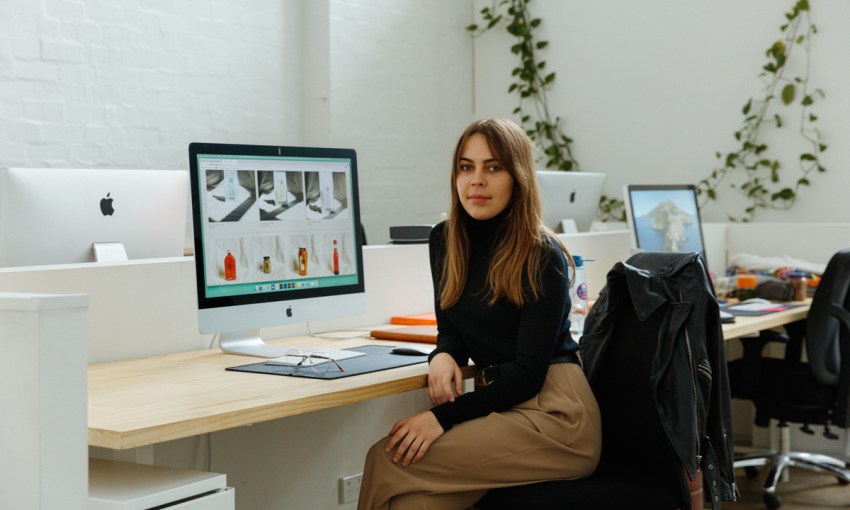
Designer and illustrator Bella McRae knows the iconic building well, having worked at Crack as a barista beginning in 2016.
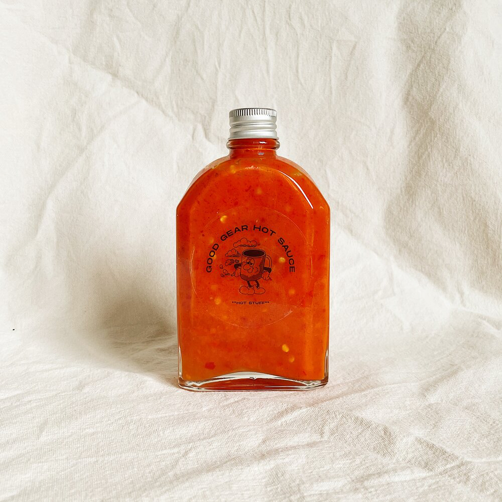
The café recently launched an offshoot retail business, called Crack Merchants, selling pantry items like coffee beans, chilli oils and pickles.
This required a brand extension and, when the Crack crew had to decide on a designer, they reached out to a familiar face.
“I started as a barista and I left three and a half years ago,” Bella says.
“Bradley [Bruni], who now runs Crack, and I have also worked together on different little projects and he approached me for the rebranding.”
Already familiar with Bella’s style, Bradley (who is the front-of-house manager at Crack) and the café’s team presented Bella with a suite of ideas for the new brand.
“They essentially provided me with a mood board of graphics that they really liked,” says Bella.
“The graphics they provided were probably a little bit heavier and a bit grungier.
“We sort of met halfway between that original pitch. And then the artistic style that I directed them in was more in line with what I thought the visuals of the café were.”
Crack wanted branding that was distinctive enough to be used on everything from take-home packaging to merchandise, without losing sight of their original identity, designed by Dave Lawson of Design People.
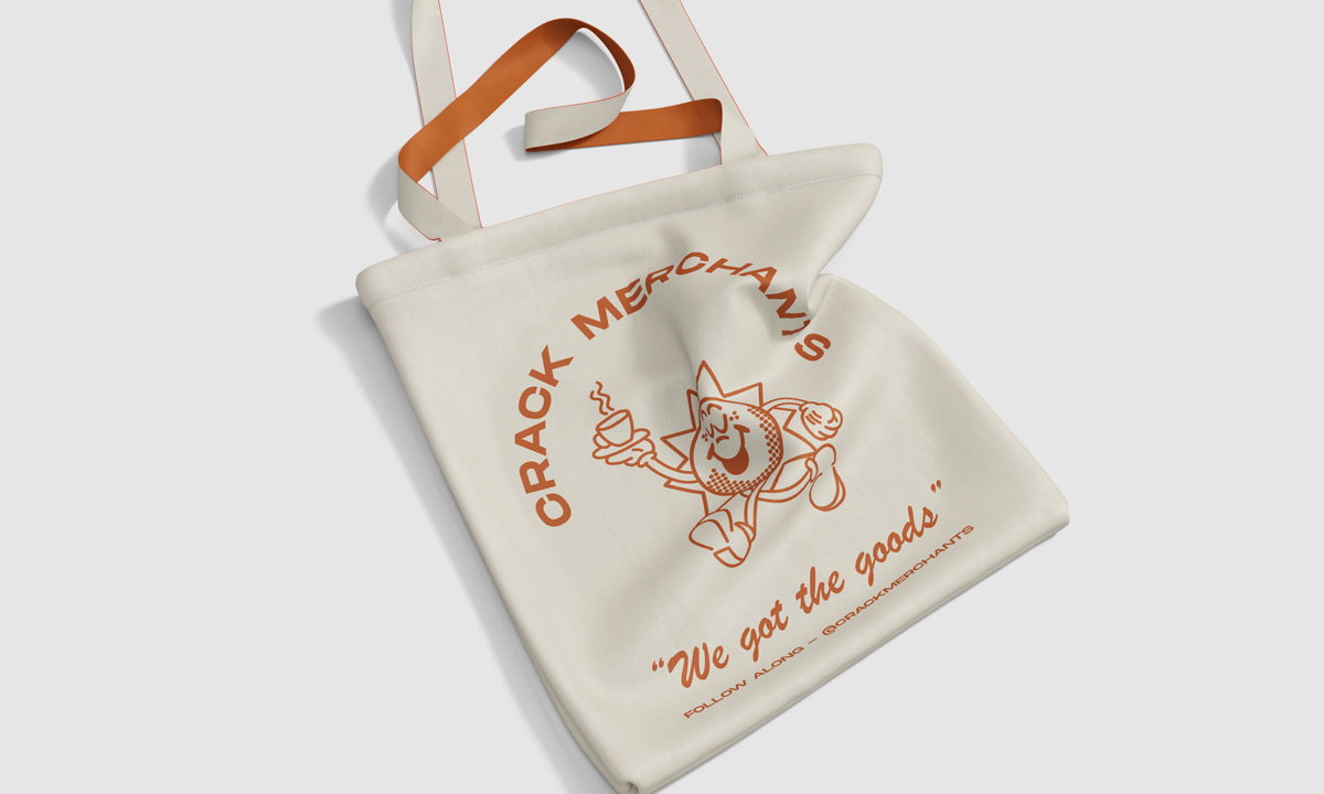
A tote bag mock-up featuring the Crack Merchants branding
“They wanted it to be quite iconic and unique and to still have some attachment to the café… but to almost be its own entity in itself,” says Bella.
“A brand that wasn’t too brandy, something that you could wear. Not like you were wearing a billboard for Crack Kitchen, but a cool cartoon.”
From this, Bella created eight 1950s-inspired cartoons in different pastel shades.
The two main assets of the set are the sun, to represent Crack’s morning café clientele, and the moon, referencing the night events the venue is branching into.
Wanting to also make use of the historical nature of Crack’s former Bank of Adelaide premises, Bella included a bank robber with a money bag in tow.
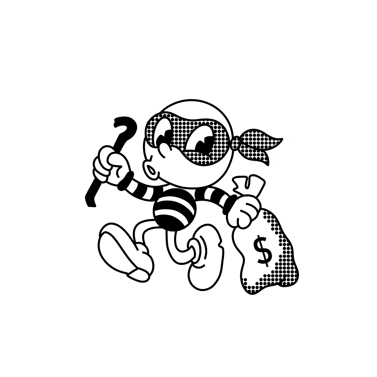
“I guess a lot of the old branding for Crack was based on that bank themed stuff,” says Bella.
“As a venue, it’s very light and airy and the people who work there are all very fun, so I wanted to incorporate all of that into what I was drawing.
“I think I represented all of that with the playfulness of the cartoons.”
Bella has been drawing for as long as she can remember, and though she has no formal training in graphic design, it’s her passion for illustration that drives her work.
“My graphic design work is inherently quite centred around illustrative work, so I’m pretty comfortable drawing,” Bella says.
“I’ve sort of fallen into being a graphic designer quite accidentally.
“My skillset is so heavily centred on my ability to draw, and the computer skills definitely came later.”
Bradley tells CityMag this illustration style that made Bella the perfect designer for Crack Merchants.
“I remember, personally, wanting that old school cartoon,” says Bradley.
“I think obviously, that’s her style. I have a lot of trust in her and she knew what I wanted to do.”
Bradley says Bella’s take on their original concept has given the brand a fresh face, which he hopes will help Crack’s regulars re-engage with the brand.
“Bella looks at Crack differently to what we do, we come here every day and we work,” says Bradley.
“She gave an outsider’s point of view; I think Bella looked in and gave her representation of the venue, which is so refreshing, I would’ve never thought to do what she did.”
Share —