

By reaching into the past, Studio Band are reimagining the future of the Coopers Alehouse brand at the Adelaide Airport and Gepps Cross.
June 23, 2016
Commerce
Coopers’ heritage typeface resurrected for new Alehouses
- 1
- 2
- 3
- 4
- 5
- 6
- 7
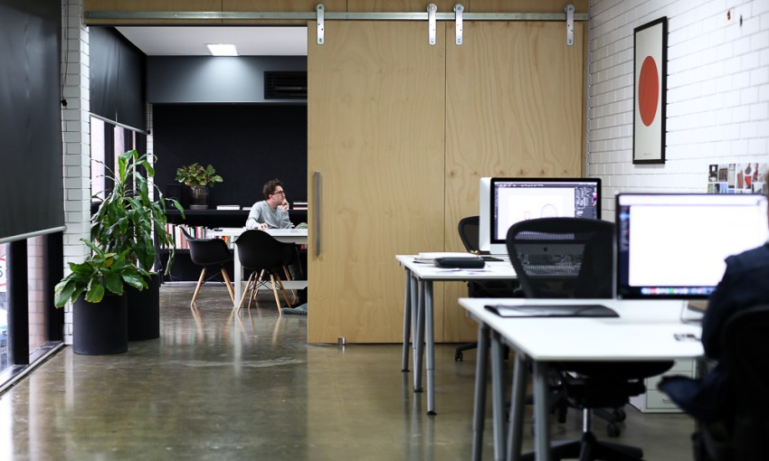
Coopers is an undeniably powerful South Australian brand, and one which Adelaide-based design collective Studio Band have worked with for some time.
What started as mostly promotional work – posters promoting pints and parmis for $15 and the like – has evolved into Band taking the Coopers brand into a more physical space.
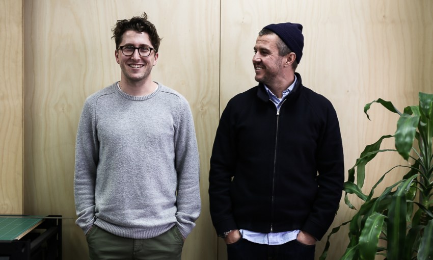
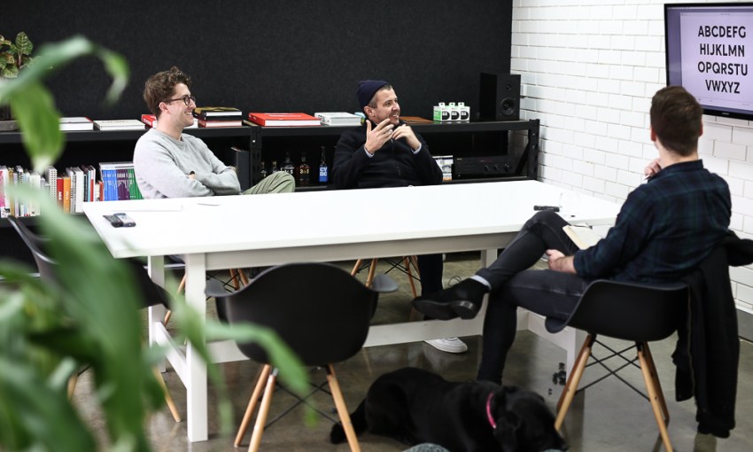
“We’ve had a pretty good relationship with them for a while and done a bunch of work with them in all kinds of areas, but… this has been the biggest opportunity for us,” Band’s Creative Director, Chris Cooper says.
“It’s very venue-focussed, and this is about creating a new brand for the Alehouse.”
While many people may feel there is one true Coopers Alehouse, The Earl of Aberdeen Hotel on the corner of Pulteney and Carrington Streets, the concept has recently expanded to Gepps Cross and the soon to be re-imagined Adelaide Airport location.
At Gepps Cross Studio Band lads worked to tie Folland Panozzo’s architecture together with the Alehouse brand. At Adelaide Airport, band are working with longtime collaborators, Studio Gram.
“Studio Gram are doing the interiors for the airport, so… that’ll actually be impressive. Probably one of the nicer bars in Australia, I think, in terms of in airports,” Chris laughs.
“They picked up on… historical elements, but applying a bit of a contemporary spin on it, in the same way that we’ve approached it.”
“So the idea was… tapping into something authentic feeling, or old school.”
– Shane Keane
– Shane Keane

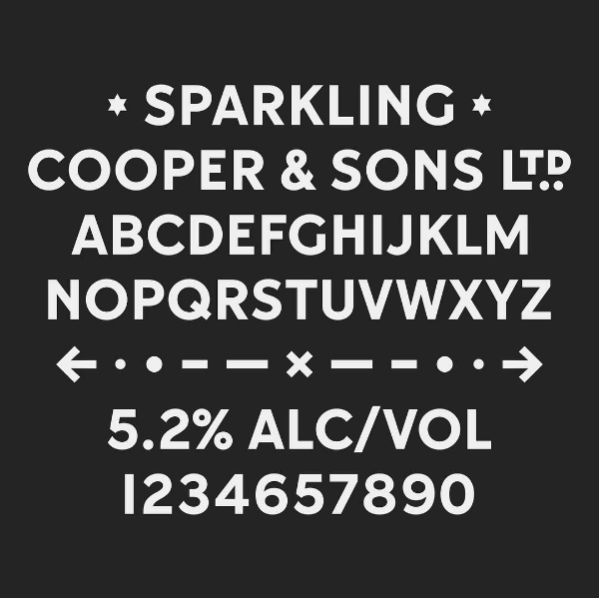
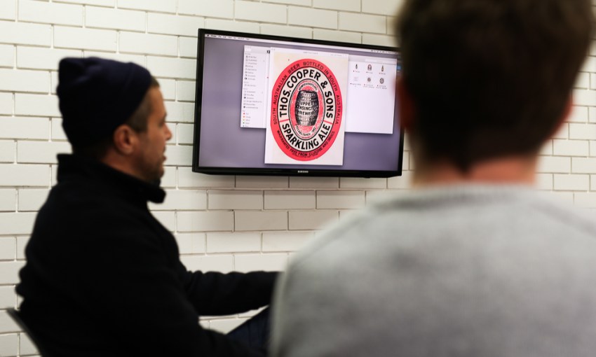
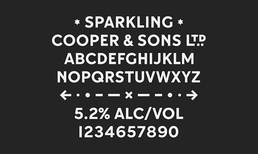
For Band, their own historical digging helped them to develop a font for the Alehouse signage.
While trying to remain contemporary, they also took inspiration from the Coopers beer labels of years gone by.
“So the idea was… tapping into something authentic feeling, or old school,” Senior Graphic Designer, Shane Keane explains.
“The old labels have something to them… there’s nice little quirks, like the ‘S’s are a bit sort of kooky, and the ‘N’s have got a little leg which kind of connects a little bit up the stem, the ‘G’ is pretty cool.”
“There’s a massive historical element, which we thought ‘wow, we’ve got this kind of amazing library of old labels and reference imagery,’” Chris adds.
“Shane just started looking into that, in terms of creating more of a mark and a brand with it.”
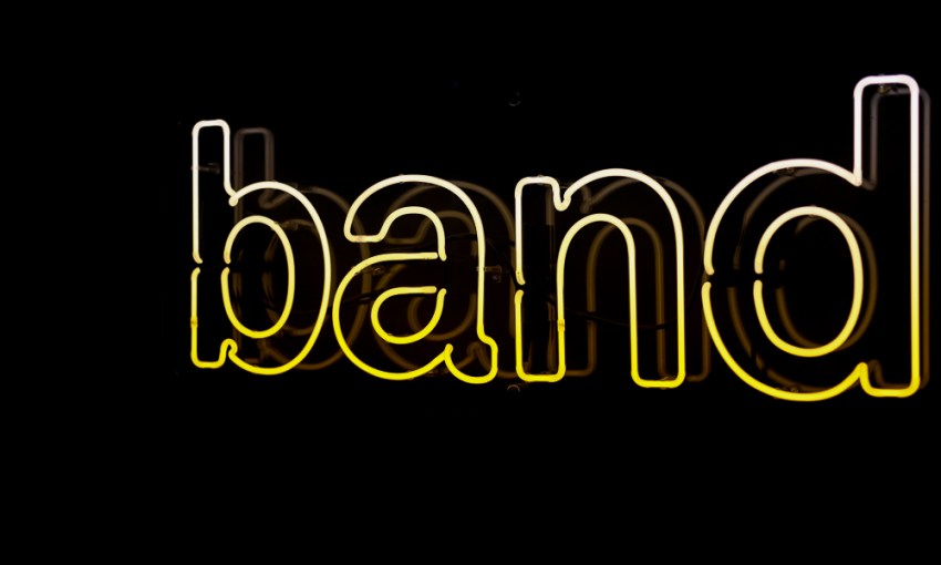
They named the resulting font Sparkling Bold. Created in collaboration with type designer, Dave Foster, it will be seen as on the Coopers Alehouse’s signage, which will also feature custom-made neon signs that give a further nod to the past.
“The neon signage is all stainless steel, rolled, there’s no acrylic or anything. No shortcuts. It’s done the hard way,” Shane laughs.
But that’s the kind of effort you put in when taking on a South Australian icon.
Share —