

Parallax Design show us how to capture the elegance and craft of a locally-made wine.
May 12, 2017
Partnership
The Lambrook look
- 1
- 2
- 3
- 4
Back when CityMag first caught up with Lambrook in December last year, Brooke and Adam Lampit had just put their label through a redesign.
“We needed to reinvent ourselves, and we needed to make the labels connect with what we’re doing,” Brooke said at the time.
Remarks
Visit Lambrook’s website to see what wines are currently available and keep an eye out for when this season’s grapes are eventually available in wine form.
“The thing with the old label is… it’s clean and it’s simple… Looking back on it now – simple doesn’t sell and that’s a big problem,” Adam continued.
Looking at the label for their 2013 Shiraz, simple is very accurate; monochromatic but for some spots of grey and bereft of any striking detail, the only allusion to their hands-on approach being the too-neatly scrawled ‘LB’ at the top of the design.
Simplicity sufficed when simplicity was part of the Lambrook business model, but the Lambrook range had expanded and Brooke and Adam had moved beyond applying the labels themselves in their kitchen.
It was time for the label to evolve with them, and so they enlisted the services of Parallax Design.
“[Brooke and Adam] are very boutique, and they’re very hands-on, and I think they were just ready to make that next step,” Parallax designer, Kellie Carpenter-Illingworth, says.
“It was a pretty dramatic change, so there was a lot of consultative discussion around working with them around that and managing that change.”
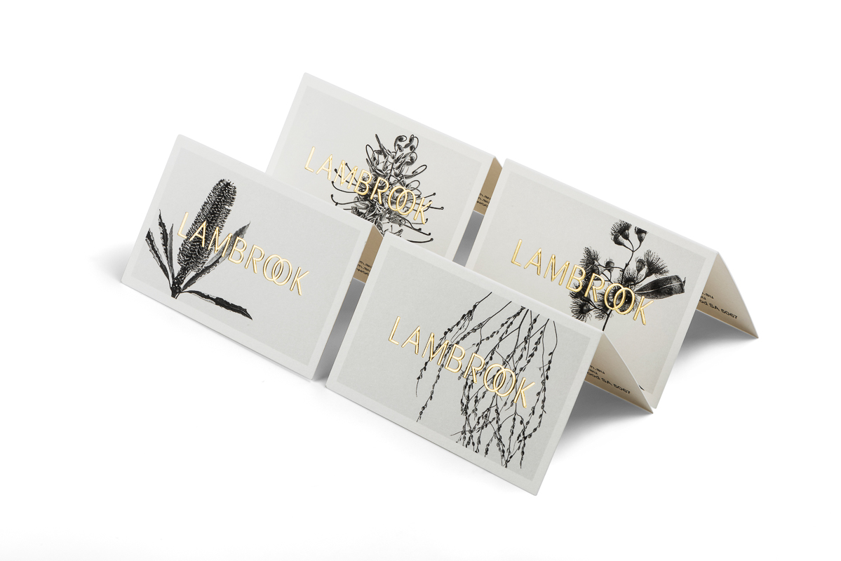
First, Kellie worked with Brooke and Adam to find a focal point for the brand. They decided on the couple themselves and the Adelaide Hills.
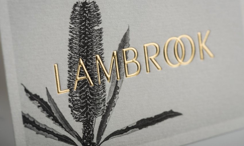
“The idea of the interlocking Os in Lambrook is to symbolize them and their marriage. I don’t really want everyone to look at that and go ‘Oh, that’s the takeaway from that,’ but it’s weaving that story around their commitment to each other… and going ‘Are we going to do this, or are we not going to do this?’” Kellie says.
To capture the Adelaide Hills, Kellie drew on the knowledge of Estee Austin from Austin Bloom to find flora commonly found in the region.
“I was hoping to do things that had originated in the Adelaide Hills, and that had to be quickly adjusted to things that you could find in the Adelaide Hills, because finding native Australian plants – when you think of natives you think of Banksias and things like that, but they’re actually all South African varietals,” Kellie says.
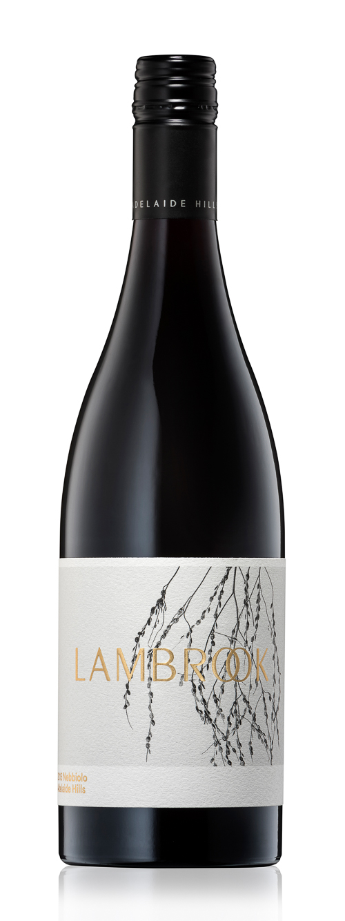
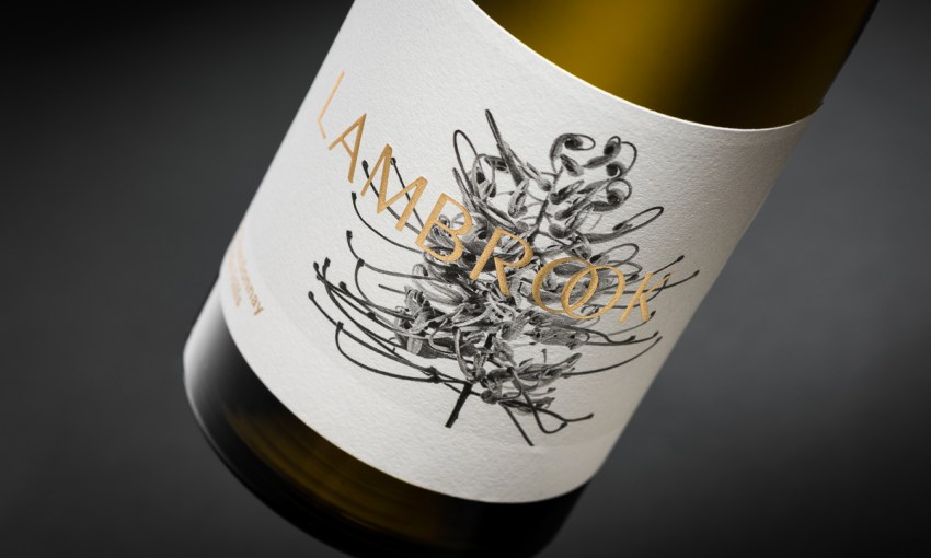
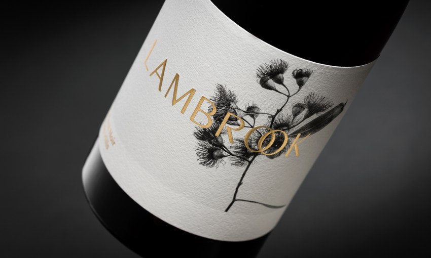
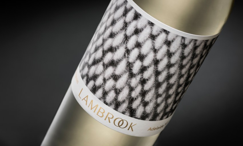
“The beautiful black and white photography [has a] botanist, naturalist point of view… The process was black and white being very classic and really simple, and then the gold foil over the top of that… I wanted to keep everything quite minimal and pared back, and you’ve got those textures of the flowers, so I guess, in terms of the process of that, it was pretty simple.”
The result is elegant in its detail, elegance being a cornerstone of the Lambrook brand, particularly in relation to the fine-beading bubbles of their Emerson Sparkling.
The floral theme also allowed for consistent branding around Lambrook’s pricing hierarchy.
The entry level range of wines use seeds as their focal point, the “classically evolved” range feature plants, and their premium drops, like the aforementioned Emerson Sparkling and Amelia Shiraz, focusses on flowers.
“I think we’ve pin-pointed something that Lambrook can hang their hat on, that being the floral [images], and that brand now, whatever they choose to do with it, whether they choose to do an event or choose to do a print ad or whatever, it can carry through nicely and stand out,” Kellie says.
The redesign has also opened up Lambrook to a raft of new audience-engaging possibilities, Kellie says.
“Positioning them in something like Bowerbird or Sydney Food and Wine, if you’re under the roof with 300 other people, how does yours stand out? I think they can stand there now and proudly go ‘This is us, this is who we are,’ and they are seeing good responses from that.”
Share —