

Designers James Brown and Claire Markwick-Smith combine spectacularly in Chicco Palms – a neighbourhood restaurant that feels at once very global, and very local.
August 28, 2017
Habits
The story behind Chicco Palms’ design
- 1
- 2
- 3
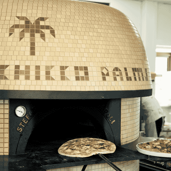
The Chicco Palms design process started where all good Italian restaurants start – with the pizza oven.
Remarks
See the Chicco Palms design first hand by visiting the restaurant at 437 Henley Beach Road, Brooklyn Park. It is open every day from 11.30am, except on Mondays when it is closed.
Venue co-owners Peter DeMarco, Silvia DeMarco, Phillip Tropeano, Natalie Albany, Ernesto Sestito and Domenic Maurici had gotten close to ordering that crucial instrument, when Peter made a call to James Brown – the designer well known for Africola, Parwana and Bali’s Motel Mexicola.
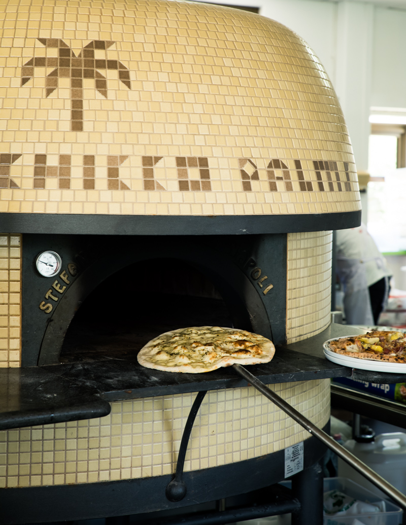
“When Pete and I started talking about me becoming part of the team, he said the only thing I have to do real quick is send off the tile design for the oven because it takes four months to make and then they have to ship it,” says James.
“So the oven was the start of the whole thing.”
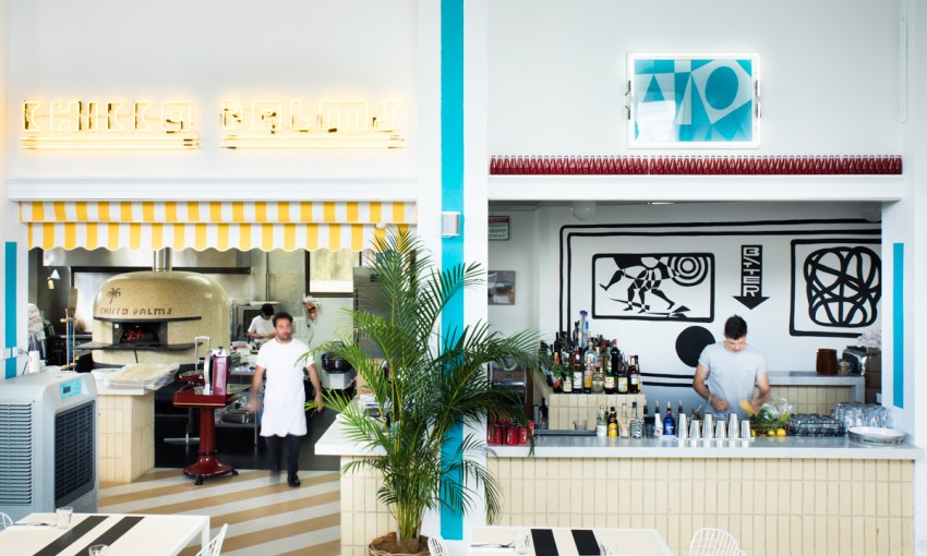
Now ensconced in Chicco Palms’ kitchen, the beige tiled oven emblazoned with a palm tree and the venue’s name provided a jumping off point for a whole-of-venue design that blends elements of Italian-Australian architecture with a bright and open interior.
“We thought it was important to play on the nostalgia of the area.” — Claire Markwick-Smith
“I wanted to reference the Italian homes with the brown and cream brick and from there it just started happening,” says James.
Almost immediately after designing the oven, James brought in Claire Markwick-Smith – an interior designer he works with at MASH to work on the Chicco Palms design with him. Claire was still completing her interior architecture degree when she agreed to the collaboration, making it her first full-scale commercial project.
The pair’s complementary strengths were essential to the successful fit-out of the eatery, which inhabits an old Barnacle Bill’s premises on Henley Beach Road in Brooklyn Park.
“James has this amazing concentration on and experience with paint, and he really taught me how you can lift and add extra to the space just using little details,” says Claire.
James Brown’s retail moment
“And that combined with my interior architecture education and my concentration on materials really worked.
“That’s why we have this combination of cream brick, and we have the marble on the bar tops, and you have the lino, and we’ve got the breeze blocks too. The final detailing of the paint to the materials really just finished it off.”
The mix of materials blends in with and draws upon the surrounding neighbourhood – something James and Claire wanted to pay homage to in the restaurant’s aesthetic.
“We thought it was important to play on the nostalgia of the area,” says Claire.
“And being out in the suburbs, it has to be aimed at so many demographics – it needs to be approachable for all different ages, whether you’re a family, whether you’re in your 20s, whether you’re a kid.”
Those materials also speak to the other central inspiration for the design – Italian-American eateries, which Peter DeMarco was keen to celebrate.
The colour palette started out by following this inspiration too, but evolved into something a little closer to home.
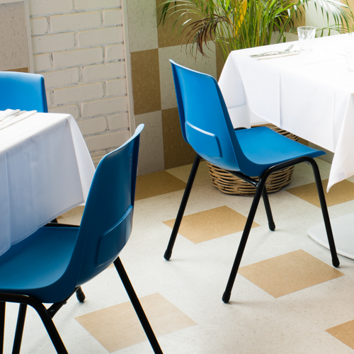
“We wanted beige chairs initially, but we couldn’t find them – so that was where the blue came from,” says Claire.
“And then I came in here and I was going to paint the columns and walls all white, and then I decided we needed some blue,” says James. “And then all the yellow stuff rocked up and I was like, ‘oh my God, I have just done Barnacle Bill colours’, but it’s good. It’s such a retail moment.”
The logo too, happened after a series of connected events led to a solution. James came across the inspiration for the purpose-made typeface while researching pizza ovens.
“I basically created a font based on one of the first pizza ovens in Napoli,” he says. “They hand-tiled the oven and it had little numbers and stuff on it, and I just ended up recreating a font based on that, and it’s all just based on the tiled grid.

The purpose-built typeface
“Which you can see in the P – it’s really awkward, it just has that tile on the angle in the middle.”
Signature James Brown touches, like a wall mural behind the bar created by James and Kaspar Schmidt Mumm, as well as framed photos by John Laurie lining the walls and custom-made branded crockery, complete the Chicco Palms design.
Mixing these slightly offbeat elements with the instantly recognisable is what makes Chicco Palms’ design so universally attractive.
No matter who is sitting down to eat – be it the group of 30 senior citizens who were there when CityMag visited, or a trio of 20-somethings – they feel at home, and that’s really what the best restaurants are all about.
Share —