

Adelaide architecture firm, Skein, show that less is more when creating a commercial pop-up bookend to the highly-trafficked Colours of Impressionism exhibition.
May 15, 2018
Culture
Selling the Impressionists
- 1
- 2
- 3
- 4
- 5
- 6
Moving through the Colours of Impressionism exhibition in the Art Gallery of South Australia, much of Adelaide architecture firm, Skein’s influence in the Elder Wing remains understated.
Freshly painted walls, all “subtle shades of Pantone greys,” softly cushion and contrast the artwork; and each gallery space is bookended with arched mirrors – a design cue taken from outgoing Art Gallery director, Nick Mitzevich.
Remarks
Colours of Impressionism is open to the public now until 29 July, with guided tours happening daily at 11am, 2pm and 3pm. To purchase tickets, see here.
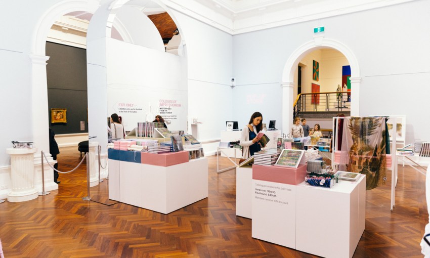
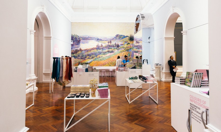
This is the appropriate tack when working with art as significant as that of the Impressionists, but in the final room of the exhibition, the Colours of Impressionism pop-up shop, Skein’s design becomes much more prominent.
“It actually turned out that the shop was quite a large component,” James Martin, one half of Skein, says. “Initially the brief was we’re doing these things in the larger exhibition space, and then maybe a retail component, but it was quite a large retail component.”
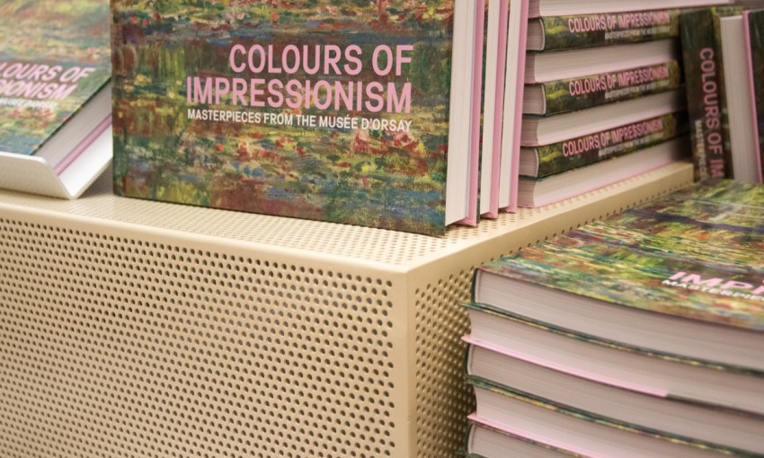
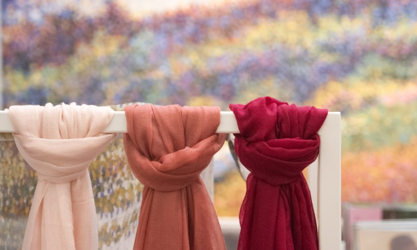
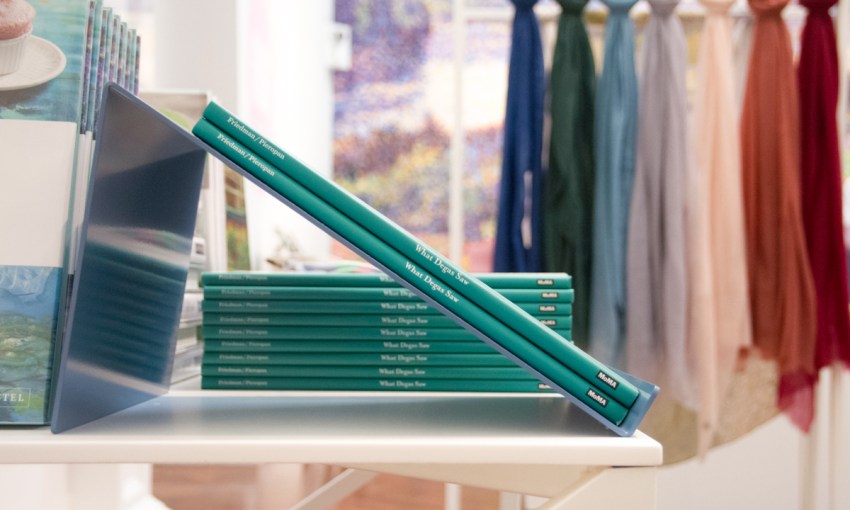
The space is stocked with movable shelving units, perforated boxes designed by Skein, used to house objects that heavily reference the vibrant colours of the artwork, and so, again, it was a case of complementing and not competing with the objects in the room.
“There’s a lot of merch, and they’ve got a lot of items they want to showcase,” Steve Hooper explains.
“We thought all of that is really colourful, so if we make our pallet really white, stripped back to just basically bare colour, then they can frame their scarves and totes and all the books and postcards and everything with it.
“And then just picking up on a series of colours, pastel tones from the work in the exhibition, and then just punctuating the white with those elements.”
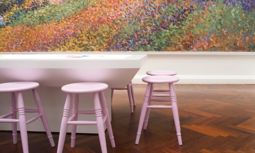
The function of the space is not purely commercial, though; James and Steve both saw that it could be an opportunity for visitors to the gallery to decompress after touring through such a vivid exhibition.
“It’s a bit of a place of respite as well, after people have tried to absorb five galleries of significant artwork,” James says.
“They come into this space with some chairs and things in there, and… it’s quite sparse, so people can re-gather their thoughts and slowly peruse the merchandise in there.”
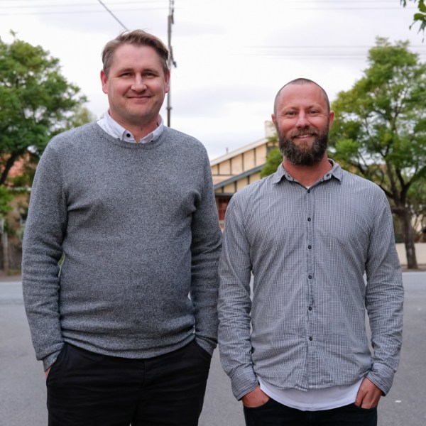
Steve Hooper and James Martin of Skein.
For Skein, the perks of this particular assignment were in contributing to such an incredible exhibition, and “knowing there’s a relationship with Musée d’Orsay, [it’s] incredible just to be able to even be connected with that in any way,” James says.
But more than that, it’s the ongoing relationship with the Art Gallery, who, James also says, make for great collaborators.
“They give us a lot of freedom, generally, on most objects, and in material selections as well,” he says.
“As long as the materials are materials that are suitable for exhibition spaces. We’ve worked on, for instance, the Sappers & Shrapnel exhibition and used Besser blocks in the space, and we used raw steel, plywood that’s not properly finished.”
“It speaks to what the art is saying as well, it’s good dialogue,” Steve continues.
“It was like artillery shells that have been carved into a vase, it was really amazing stuff… It was art from the trenches, so we designed this room in the middle of the exhibition, which was housing the war memorial art pieces that were actually made in the trenches.”
As the institution itself moves into a post-Mitzevich era, the lads hope Skein will continue to contribute to the Art Gallery’s future, and how visitors experience the space.
Share —