After almost 20 years in the industry, corporate winemaker Peter Dredge decided it was time to introduce his independent alter ego, Dr. Edge, to the world with some unconventional design.
Same, same but very different
Despite their best efforts, winemakers cannot be at point-of-sale every time you need help deciding which red varietal might best accompany your summer steak night.
In such a saturated market, a winery’s story can be the deciding factor, and so the task of conveying that message is entrusted to the bottle’s label.
For established brands, a bold seriffed font or a delicate cursive script might convey a notion of class and a more traditional experience, whereas an earthy-toned hand-drawn label with a rubber-stamped batch number on the back suggests a smaller operation and perhaps a craftier drop.
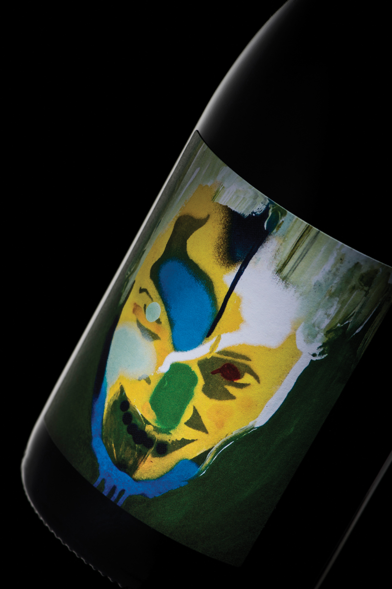
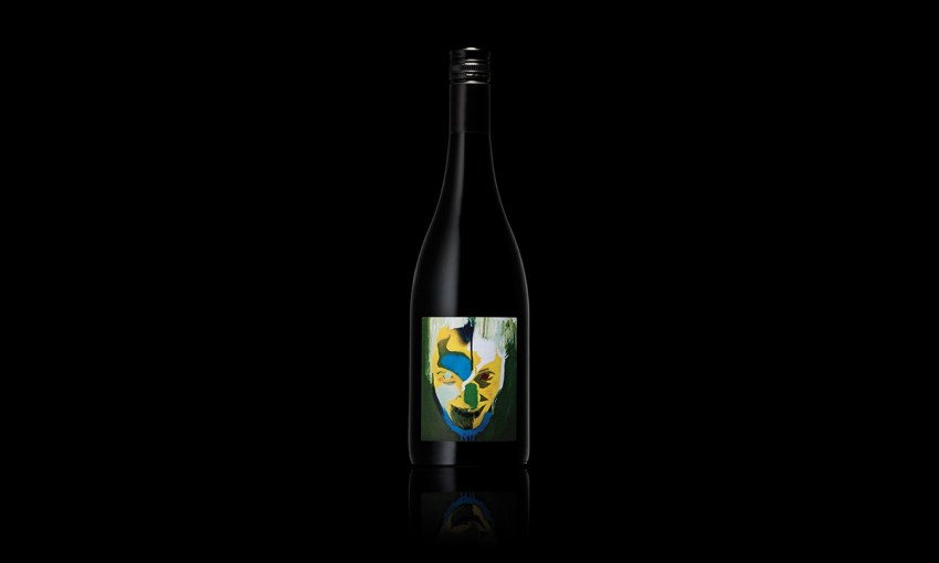
In the case of a bottle of Dr. Edge, even winemaker Peter Dredge isn’t sure what you might read from the manic stencil-graffitied face.

“I often wonder what people think. It’s pretty dark, I probably look like a complete weirdo,” Peter says.
“It was a bit of a risk; a lot of guys rely on very floral, bright, lovely, happy labels – I just wanted to go on the other side of the spectrum.”
The unwritten story behind the graphic is one of personal identity – after 20 years in the industry as a corporate winemaker, Dr. Edge is Peter finally unshackled from the constraints of making wine for other people, now following purely his own desires.
The artwork was pulled from a ’90s hip hop album and re-appropriated for the label, with a range of background colours used to connote different sub-regions of Tasmania from which Peter sources his grapes.
“It took me 10 years, but I found the artist, got permission, and actually purchased the original artwork out of Bristol about four years ago now,” Peter says.
“I had a very firm belief that that’s what I wanted on the front label, and then taking the idea [that] I wasn’t making wine to a style or to a contract – this is purely independent – that’s where the alter ego thing came in.”
With such a prominent part of the branding already decided, the next step was creating the broader visual language of Dr. Edge Winemaking around it.
For this, Peter collaborated with Damian Hamilton of Cornershop Design, an old friend he’d met through Adelaide connections while they were both in London in ’05.
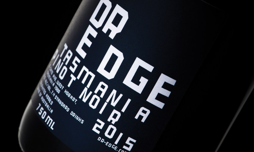
“We looked at some solutions where the logo, the brand’s name [and] the [grape] variety were incorporated on the front label with the face, but it ended up being the strongest solution if the face was on the front and then everything else sits on the back, which is very unconventional,” Damian says.

Cornershop’s typography was designed to complement the main artwork
“In this case the artwork [is] the face of the brand… so building on that brand, the typography, the brand logo that we created, was something that just really complemented the execution, the graffiti style of the artwork.
“It’s very raw and rough and experimental, so we took inspiration from experimental typefaces, old ’90s albums, Nike posters and graphic design, art and illustration that represented a fractured personality.”
The result is a darker and slightly more confronting label than you’re likely to find elsewhere on the shelf at your local, but that is exactly its appeal.
“The risk is the reward, isn’t it? That’s what gets noticed and that’s why people are picking it up, because it’s so different,” Damian says.
“Because it is so unique, it’s carved a niche and is resonating with certain individuals, and obviously [Peter has] a fine reputation as a winemaker… it seems that a lot of people are really appreciating it. I think it’s working wonders.”


