

Maintaining a brand’s integrity while refreshing its graphic identity is a skill unto itself. Graphic designer Matt O’Connor shows us how it’s done.
July 1, 2019
Commerce
Rebranding Little Bang Brewing
- 1
- 2
- 3
In 2018, Little Bang Brewing made the journey into their biggest brewery yet, located on Henry Street, tucked behind the Maid and Magpie pub in Stepney.
The move symbolised a growth in the business and spoke to the increasing demand for Little Bang products.
Remarks
Little Bang Brewing Company
25 Henry Street, Stepney
Thursday: 4pm ’til 10pm
Fri-Sat: 12pm ’til 10pm
Sunday: 12pm ’til 6pm
Coinciding with their physical expansion, founders Filip Kemp and Ryan Davidson, along with their partners Katie Kemp and Kerri Davidson, decided it was time to rework the company’s brand identity and put the Little Bang Brewing name front and centre.
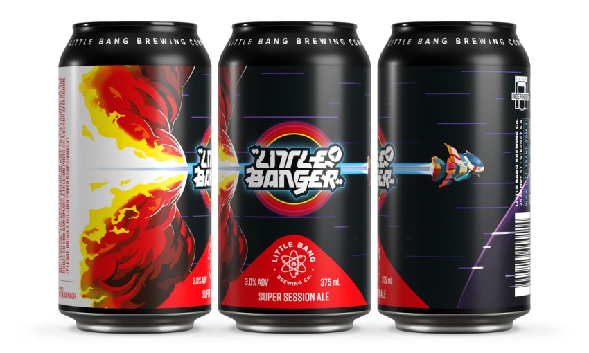
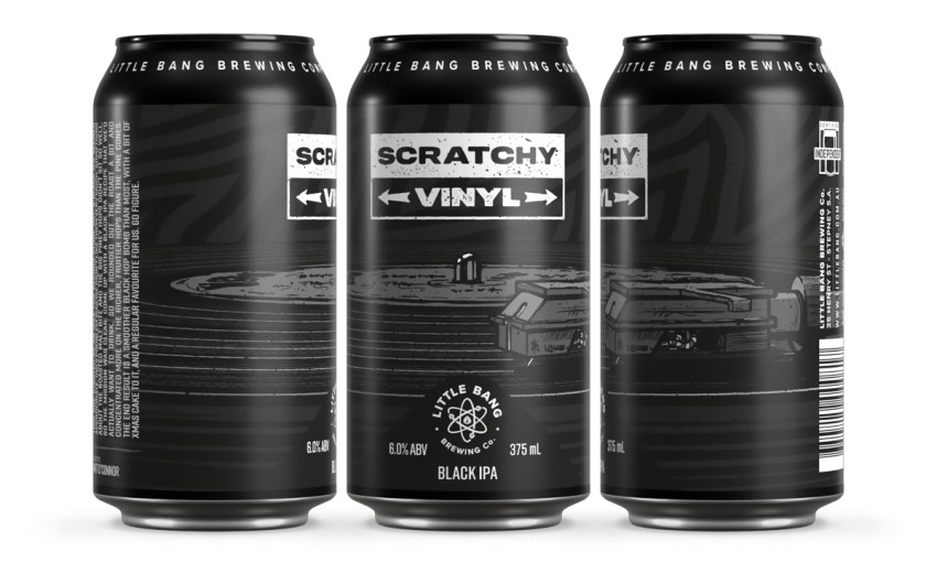
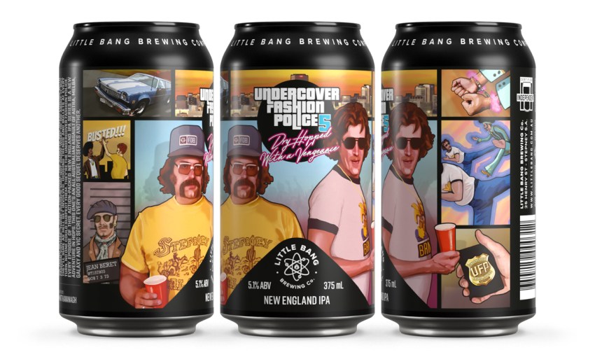
“Initially, before we did these cans, we were very much art focused and the branding was kind of secondary,” says Little Bang’s graphic designer Matt O’Connor.
“So, the aim was to bring the branding around to the front but not detract from the unique art pieces as well. So that was kind of the difficult situation. The big problem to solve,” says Matt.
Since building a brewery in Fil’s garage in 2013 and releasing their first beer shortly after, the Little Bang name has become synonymous with the interesting, thoughtful, funny and sometimes provocative artwork wrapped around their beers.
And no one at Little Bang wanted that to change.
Initially, Fil and Ryan wanted their name to remain hidden. While the competition might print their name large over their products, Little Bang wanted theirs to be as discrete as possible.
But, as Little Bang gained broader distribution and their beers began hitting shelves beyond South Australian borders, the company needed their logo to take a more central role.
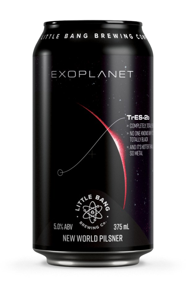
“We needed the branding and alcohol content on the front, so we went for the triangle shape,” says Matt.
“It gave us an ownable shape, which we could kind of punch up or push back in the design, then take on different colours or no colour. And keep a degree of consistency for the range.”
Matt says they wanted the beers to sit next to and complement one another.
“We’re using different colours in different situations, depending on the design.
“It’s all depending on what the background art is and if we want to pull the art out and what colours we should pull out.”
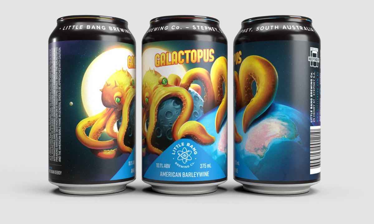
Matt is not only the brains behind the refreshed can branding, he also designed the artwork for Little Bang’s Exoplanet beer series – one beer in six different can designs.
Each design was inspired by one of six exoplanets (for example, TrES-2b is the darkest known planet in the universe).
A good graphic identity not only lifts your presence in a retail environment but can become part of a bigger marketing strategy. Putting the same beer in six different containers speaks to the dedication and craft that sits at the core of what this business does.
Beer isn’t just drinkable these days – with good design – it can be collectible, too.
![]() CityMag is celebrating the best food and drink businesses in Adelaide throughout July
CityMag is celebrating the best food and drink businesses in Adelaide throughout July
Share —