

Archival advertising from the 1900s, 3,000 sheets of gold and a shattered mirror at the eleventh hour – the incredible story of bringing the Coopers brand to life at the Adelaide Airport.
September 29, 2016
Commerce
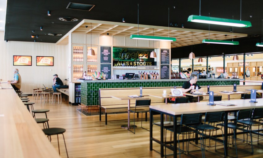
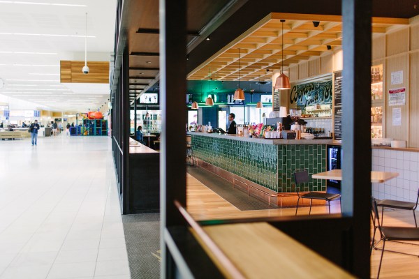
A closer look at the new Coopers Alehouse at the airport
- 1
- 2
- 3
- 4
- 5
- 6
- 7
- 8
- 9
- 10
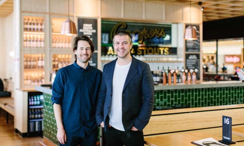
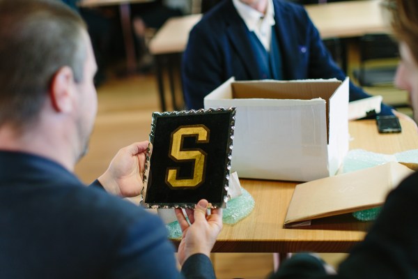
Before the interview officially commences at the recently unveiled Coopers Alehouse at Adelaide Airport, artist Tristan Kerr hands his client and creative director of Studio Band, Chris Cooper, a pair of bubble-wrapped parcels.
A token of gratitude from the artist – both a thank you and apology in one: hand-scalloped glass panels with the letters S and B rendered in 20 karat gold leaf.
The gesture epitomises the respect between the two and acknowledges the magnitude of the job they’ve just completed.
Remarks
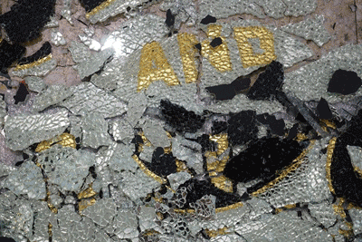
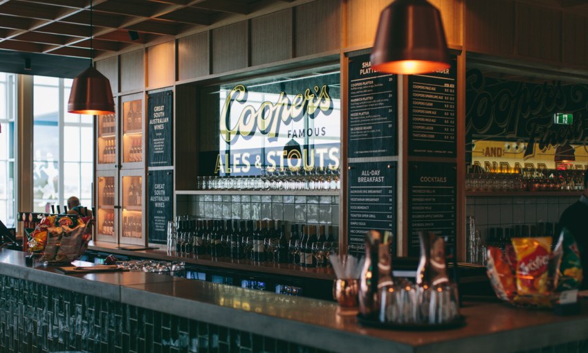
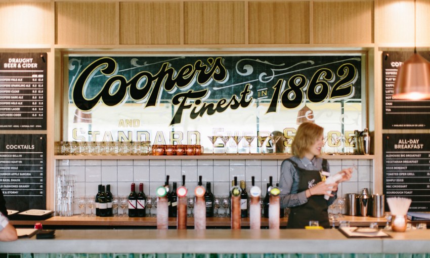
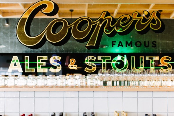
There’s a story hidden behind the hand-painted mirrors at the airport Coopers Alehouse, which stand strong and unblemished today. Before the current mirror, there was another complete mirror, adorned with 1,000 individual gold leaves.
While being prepared for shipping the 3m long piece of glass briefly touched the floor tiles of Tristan’s studio shattering 100 hours of painstaking work into several thousand pieces of glass in his and the courier’s hands, meaning the artist had to create a whole new piece from scratch and in time for the official opening by Dr Tim Cooper.
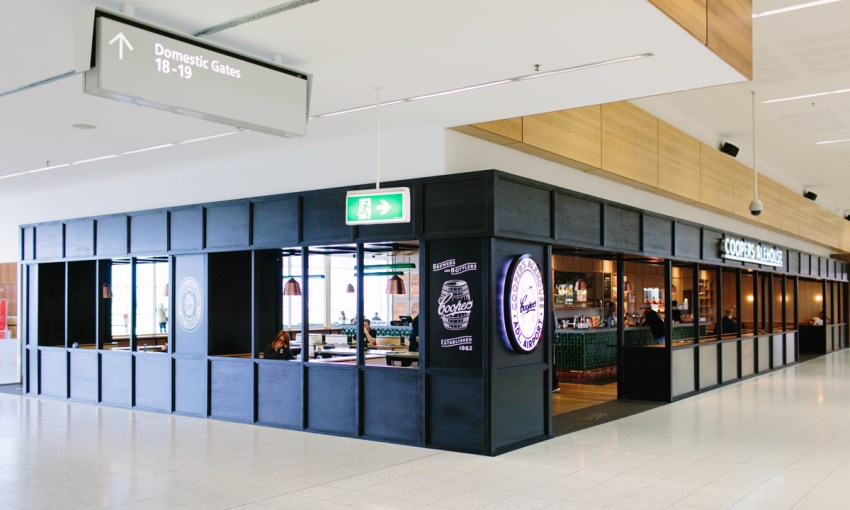
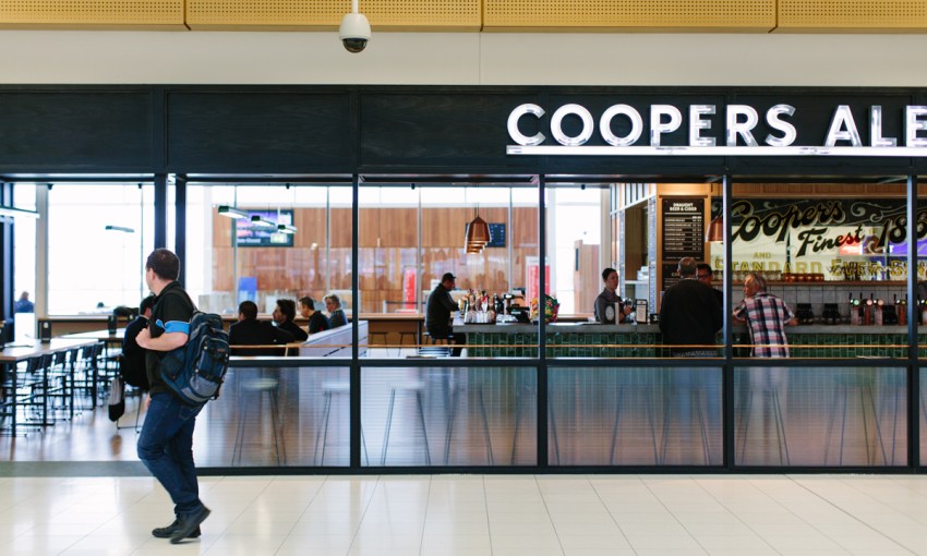
What started for Studio Band as a relatively straight-forward signage project at Gepps Cross ended up as one of the most thorough inspections of a heritage South Australian brand we’ve seen to date, and culminated in the epic-yet-understated Coopers Alehouse at Adelaide Airport.
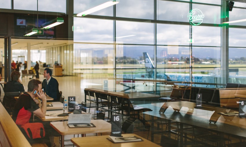
As you emerge from the metal detectors and “random” bomb-residue pat-down at the Airport, the new Coopers Alehouse stands before you as an emblem of Adelaide’s future direction.
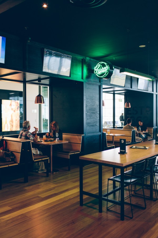
The new bar fit out is a complete overhaul.
Architects Studio–Gram have completely re-imagined the space and, in the process, given new life and context to one of Australia’s greatest brands. And within the framework of the Studio-Gram architecture, Studio Band used cues from their signage project at Gepps Cross and artist Tristan Kerr’s skills to celebrate Coopers at the airport in great detail.
But it wasn’t a light-hearted project – the intelligence behind the interrogation of the Coopers Alehouse brand is deep.
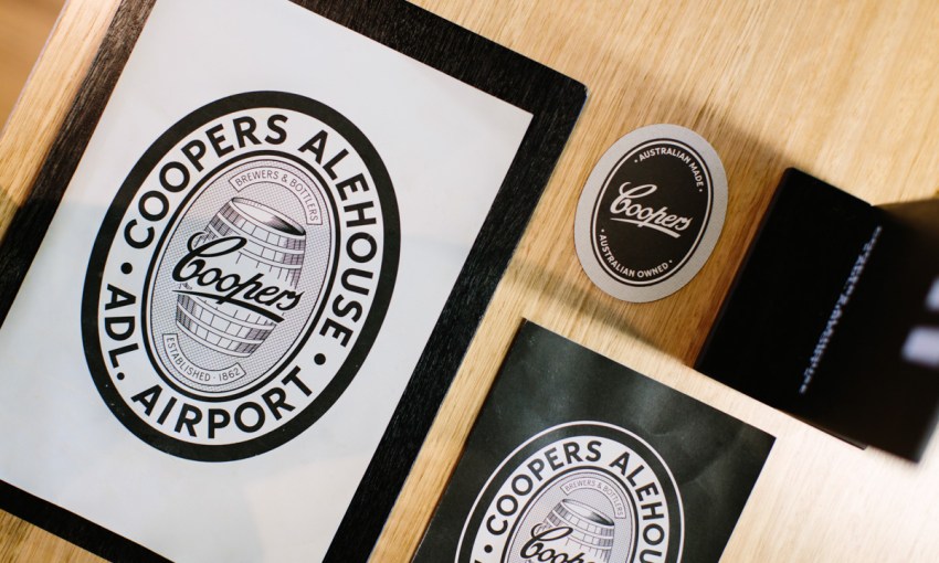
Tristan’s art practice is based almost entirely around the visual language of typefaces and language used in historical advertising. His background as a designer and progression through screen printing to sign writing and specifically gold-leaf made him the perfect collaborator for Studio Band who had already delved into the Coopers archives to re-animate the roots of the Coopers identity.
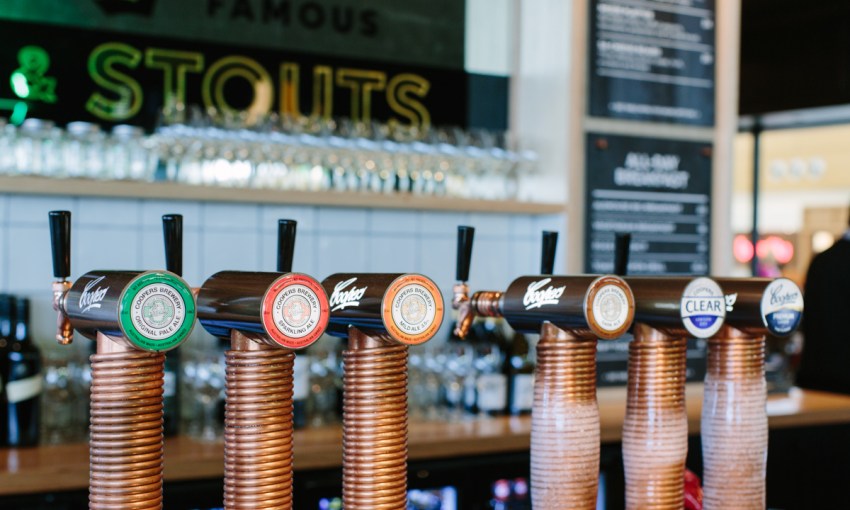
“There are some consistent elements, like the light boxes, the hand-rolled stainless neon, but there are some points of difference between the Adelaide Airport and Gepps Cross sites,” says Chris.
Tristan’s huge glass and gold-leaf artworks that sit in the backbar are probably the most obvious.
‘this looks like you’ve ripped off the Coors Beer aesthetic– what’s this Coopers thing?’ – Tristan Kerr recounting the response on social media
“It was quite interesting for me, the language of the artworks as well,” says Chris.
“We actually found a lot of the wording from old advertisements and point of sale stuff they had. The ‘Finest in 1862 and Standard Ever Since’ was from an old ad. And the ‘Famous Ales and Stouts’.”
That language fits seamlessly with Tristan’s practice to date. These words and phrases, and even the treatment of type that Tristan has resurrected for the project seems quintessentially American in 2016, but in 1862 – when Thomas Cooper first started marketing his “famous ales and stouts” – the influence would have been far more British than American.
“It’s funny you bring this up,” says Tristan, “people on social media were saying ‘this looks like you’ve ripped off the Coors Beer aesthetic’ – directing stuff to Coors saying, ‘what’s this Coopers thing?’ and I just had to chuckle seeing as though we’re talking about a beer brand founded in 1862.”
Far from being derivative, Tristan revelled in the chance to create artworks that held true to the origins of a brand while also exploring his own style and interests.
“For me, being able to apply all my interest in old signage communication, doing the research, sketching all the concepts by hand and presenting it to Studio Band and having their trust to really direct the artwork for those pieces was great,” he says.
The trust ran deep with Coopers too, with the client allowing Band and Tristan to go the extra mile to achieve a proper aesthetic in the bar – even signing off on some of the mirrored signage being built from scratch so that it would be visually functional no matter where the viewer was standing.
“Huge on many levels, because we were trying to educate the client on why we should build a mirror from scratch rather than simply paint over the top of an existing piece of mirrored glass” says Chris.
But the trust from all parties, and epic amounts of hard work (“I nearly had a relationship breakdown because I was at the studio nearly 17 hours a day,” says Tristan.) have paid off – the Coopers Alehouse at the airport is now just the kind of welcome or farewell that a city on the rise should offer.
Share —